Welcome to our community

Be apart of something great, join today!

Is this the worst card design ever?

Disclaimer: Links on this page pointing to Amazon, eBay and other sites may include affiliate code. If you click them and make a purchase, we may earn a small commission.

HPC

New member
Aug 12, 2008
6,709
0
Phoenix, AZ
2008 Donruss Threads

$(KGrHqR,!nUE63Tf6mueBPEOcLjW6w~~60_12.JPG


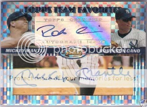
Everything looks great until you see the big white box at the top glaring at you.

Whenever I see one, I always think it looks like someone stuck one of those security devices that retail stores stick on loose card packs.

Take that away, and the card would look phoenominal.
 

jbmm161

Active member
Dec 19, 2010
1,377
1
Ft Worth
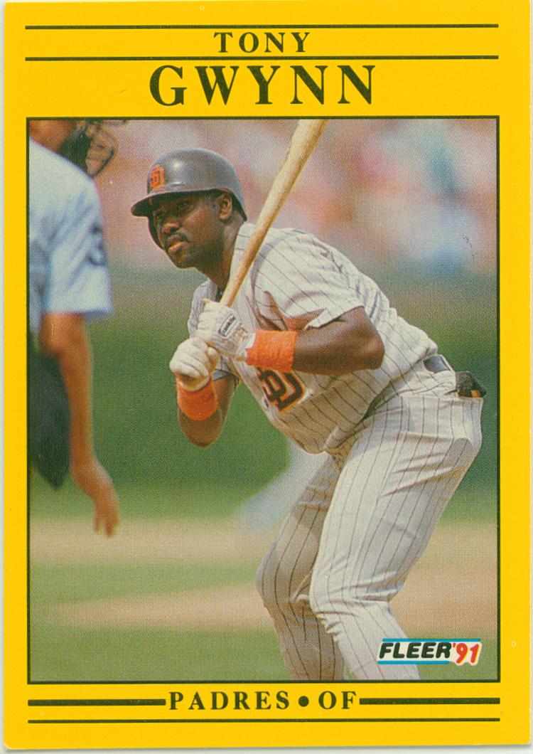
Donruss 1990 and 1991 sets where pretty bad. I actually like the yellow fleer set.
Winner winner chicken dinner:
imagesCAM5YONJ.jpg
 
Last edited:

sportscardtheory

Active member
Aug 16, 2008
8,461
2
Buffalo, New York
It looks like those little plastic things that stores put on their merchandise to set off the theft alarms, that someone typed the team's city on with a typewriter.
 
Last edited:

James52411

New member
Administrator
May 22, 2010
4,531
0
Tallahassee, FL
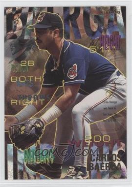
1991 Donruss was terrible and looked incredibly cheap. I also didn't care for 1995 Fleer as the cards were too busy and the names were nearly unintelligible.
 

Mudcatsfan

Active member
Aug 7, 2008
2,845
2
2008 Threads design was pretty much ruined by that one little aspect. Otherwise, its an attractive card and a FANTASTIC rookie auto checklist. Shame.
 

gt2590

Super Moderator
Aug 17, 2008
38,776
3,402
Near Philly
I second the "Pro" 1991 Fleer vote, I actually kind of like them.

But 1990 Fleer was Barkley-bad "Turrible". Which alot of the early 90s Fleer sets were, in all sports. Just awful...
 

19braves77

Active member
Oct 23, 2008
3,444
0
Pensacola, FL
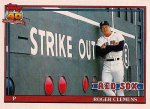
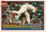
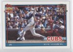
The 91 Fleer and 90 Donruss do look nice autographed in blue sharpie but one set that you cant make look nice is 1991 Topps. Terrible color.
 

James52411

New member
Administrator
May 22, 2010
4,531
0
Tallahassee, FL
The 91 Fleer and 90 Donruss do look nice autographed in blue sharpie but one set that you cant make look nice is 1991 Topps. Terrible color.

Just goes to show you how aesthetic taste differs. I think 1991 Topps is fantastic looking.
roger_clemens91.jpgnolan_ryan_91.jpg94732a24-8a9a-4654-8e2a-943fc622a04f.jpg

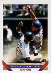
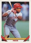
If you are going to rip a Topps design from the 1990s, I'd go with any design from 1992-1995, with the 1993 design being the worst. Talk about boring:

200px-1993_Topps.jpg1993-Topps-Barry-Larkin.jpg
 

Members online

Latest posts

Top