- Thread starter
- #1
I was looking at some different Topps sets and it struck me by how different the designs were year to year in the 60's thru 90's versus the early to mid 2000's Topps.
This led to some horrific follow up designs to some iconic sets.
1. 1994 Topps Finest Baseball- 1993 Topps Finest is a milestone for modern collectors (Refractors baby) however in 1994 Topps ran the presses and killed the design all in one fell swoop. There are some hard core fans of the refractors but I can't give away full sets of this stuff at 10 bucks a set at shows.
2. 1961 Topps Baseball- After 2 years of colorful but pretty similar designs in 58 and 59 Topps decided to go radical and make the 1960 set a horizontal set with 2, that's right 2 pictures on the front of the card. They also kept the colorful design. Enter 1961 Topps and they decided to remove all color, horizontal design and went back to one picture per card. It is by far the blandest design of the 60's outside of maybe 67. The rookie class is weak in 61 and outside of some hard SP's and a tough high series 1961 Topps is one of the easiest and cheapest sets to build in the 60's.
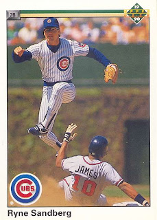
3. 1990 Upper Deck- 1989 Upperdeck really started the premium card trend and pricing ($1 a pack? that's crazy). Having Griffey be card #1 never hurt either. 1990 UD was just a rehash of 1989 with less style and design. It was just really bland and with no big RC (they seriously left out Frank Thomas?) to chase the set quickly lost it's luster and value.
4. 1992 Topps Stadium Club- 1991 Stadium Club was the next kick in the pants for premium cards. Full bleed glossy cards with gold foil? Wow! Well Topps followed Upper Deck's 1990 path in making just small changes to the design and made a very bland, very forgettable design with again no real cards to chase even in 1992.
5. 1976 Topps Baseball- How do you follow 1975 anyway right? Having 4 HOF RC's in the set (Brett, Yount, Carter and Rice), one of the best designs since 1971 and a first time ever mini version, anything Topps did in 1976 would be seen as a let down. Maybe it's due to the lack of RC's (Eckersley) pizzazz or the endless printing problems with the set, 1976 is just bland and lifeless compared to 1975. Now the 1976 Brett is incredibly tough, much more than his RC, to find in high grade and the Young, Ryan, Rose and Bench cards are still very nice but were talking about comparing a Volksagon to a BMW here.
Honorable Mentions- 1954 Bowman Baseball, 1973 Topps Baseball
This led to some horrific follow up designs to some iconic sets.
1. 1994 Topps Finest Baseball- 1993 Topps Finest is a milestone for modern collectors (Refractors baby) however in 1994 Topps ran the presses and killed the design all in one fell swoop. There are some hard core fans of the refractors but I can't give away full sets of this stuff at 10 bucks a set at shows.
2. 1961 Topps Baseball- After 2 years of colorful but pretty similar designs in 58 and 59 Topps decided to go radical and make the 1960 set a horizontal set with 2, that's right 2 pictures on the front of the card. They also kept the colorful design. Enter 1961 Topps and they decided to remove all color, horizontal design and went back to one picture per card. It is by far the blandest design of the 60's outside of maybe 67. The rookie class is weak in 61 and outside of some hard SP's and a tough high series 1961 Topps is one of the easiest and cheapest sets to build in the 60's.
3. 1990 Upper Deck- 1989 Upperdeck really started the premium card trend and pricing ($1 a pack? that's crazy). Having Griffey be card #1 never hurt either. 1990 UD was just a rehash of 1989 with less style and design. It was just really bland and with no big RC (they seriously left out Frank Thomas?) to chase the set quickly lost it's luster and value.
4. 1992 Topps Stadium Club- 1991 Stadium Club was the next kick in the pants for premium cards. Full bleed glossy cards with gold foil? Wow! Well Topps followed Upper Deck's 1990 path in making just small changes to the design and made a very bland, very forgettable design with again no real cards to chase even in 1992.
5. 1976 Topps Baseball- How do you follow 1975 anyway right? Having 4 HOF RC's in the set (Brett, Yount, Carter and Rice), one of the best designs since 1971 and a first time ever mini version, anything Topps did in 1976 would be seen as a let down. Maybe it's due to the lack of RC's (Eckersley) pizzazz or the endless printing problems with the set, 1976 is just bland and lifeless compared to 1975. Now the 1976 Brett is incredibly tough, much more than his RC, to find in high grade and the Young, Ryan, Rose and Bench cards are still very nice but were talking about comparing a Volksagon to a BMW here.
Honorable Mentions- 1954 Bowman Baseball, 1973 Topps Baseball
Last edited: