Welcome to our community

Be apart of something great, join today!

Post an ugly but VALUABLE card

Disclaimer: Links on this page pointing to Amazon, eBay and other sites may include affiliate code. If you click them and make a purchase, we may earn a small commission.

BBCgalaxee

Well-known member
Sep 9, 2011
6,475
59
There's no shortage of ugly cards, but what about truly ugly BUT VALUABLE ones?
 

Attachments

  • 1415045820271.jpg
    1415045820271.jpg
    30.4 KB · Views: 63

gracecollector

Well-known member
Aug 7, 2008
6,559
215
Lake in the Hills, IL
Any big hit from UD World of Sports

$_1.JPG
 

BBCgalaxee

Well-known member
Sep 9, 2011
6,475
59
I'd like to know how that mantle even got the "ok" to be made. I think that card is from like 2007.

Worker: Hey, I've got a GREAT IDEA boss!

Boss: What is it?

W: Let's take a sweet spot mantle auto and put it in a card.

B: Wow! Awesome idea!

W: But wait, What if we got two other "legends" to also sign it now!

B: you mean like Aaron and Mays? That sounds pricey to do.

W: no not them, well use our spokesmen, Wright and Alex! And we will have them sign in different colored ink so it's obvious to all the internet trolls that the mantle is legit.

B: You sir, have a promotion calling! And as long as the autos over lap mantle AND look squeezed, I'll also promote you to autograph quality control with an emphasis on making sure all chrome autos come out streak free!
 

mudflap02

Active member
Jan 23, 2009
3,039
3
Daytona Beach, FL
Here's one I don't think I've shown before.

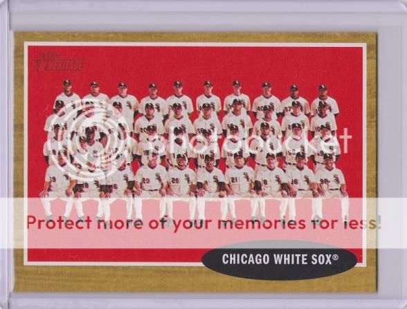
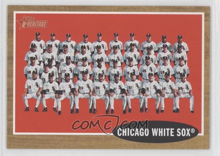
2011 Topps Heritage Chicago White Sox team red tint. It looks so close to the base card (which also had a red background), and was only available in Target packs. Ugly as hell, and probably the hardest to track down because nobody knows they have the very rare short print. Only real way to tell the difference is the small font variation and the code on the back. SP is on top.

2011redtint113.jpg


Chicago-White-Sox-Team.jpg
 

gt2590

Super Moderator
Aug 17, 2008
38,775
3,401
Near Philly
Alot of hideously bad, almost comical, cards of some Butt-ugly dudes in the 1954 set that would sell great if graded well...
 

WCTYSON

Well-known member
Nov 3, 2014
7,364
171
Not really valuable but very ugly IMO..............the Randy Johnson auto. :eek: It was the only Topps on-card auto I could find of his at the time.

128908d1361470860-mail-time-mail-time059.jpg
 

WCTYSON

Well-known member
Nov 3, 2014
7,364
171
Lone Star Sigs had some horrid designs. Is that 2000? It looks like a 5th grade social studies teacher designed it.

otmgb9.jpg

I had to check but yes, it was the 2000 Lone Star which are just horrible. At least it is not a sticker auto. I do not mind the other but your Barlow is awful. I hope the art directors responsible for these designs was fired, for the 80's was a while ago.
 

Members online

Latest posts

Top