Welcome to our community

Be apart of something great, join today!

Latest custom autograph cut...looking for opinions.

I think...

  • I like it, I'd like to see more players.

    Votes: 0 0.0%

  • Total voters
    34

Disclaimer: Links on this page pointing to Amazon, eBay and other sites may include affiliate code. If you click them and make a purchase, we may earn a small commission.

200lbhockeyplayer

Active member
Aug 10, 2008
11,049
2
After doing a vertical set for some Chicago Blackhawks cuts, I figured I'd look at doing some baseball vertical as well.

There are a few tweaks here and there, but just curious to see people's take.
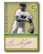
slaughter_HOF.jpg

My thought is depending on the player and team association, the bottom two color "bars" will adjust to their team colors.
 

Mozzie22

Active member
Aug 7, 2008
1,648
24
Like the design but not the team. Slaughter should always be shown with the Cardinals, IMO.

Great design though.
 

metallicalex777

Super Moderator
Aug 7, 2008
13,905
118
Seattle, Wa
Wow...that is a very amazing and intriguing style you've got there. I have never thought about what a cut auto would look like "standing up"...definitely beats most newer cuts brought out by Upper Deck and the rest of the companies taking away even the face shots. Well done bud!!!

Alex
 

i43770

New member
Aug 7, 2008
1,965
0
Portland, OR
Mozzie22 said:
Like the design but not the team. Slaughter should always be shown with the Cardinals, IMO.

Great design though.

I actually like it a little more because he isn't pictured with the team he is known for. There are a lot of team collectors who want autos of all the players that played for their team, but want them pictured in that teams uniform. I think UD and/or Topps should do that on their autos of players that aren't currently playing. Or at least make it a parallel.
 

200lbhockeyplayer

Active member
Aug 10, 2008
11,049
2
A few things about this cut:
1. Slaughter is/was rarely pictured with the A's considering it was the end of his career and only spent 200 games with them (about as much time as he spent with the Yankees, and yet you see a lot of Yankees photos of him), so I wanted a completely different look for him.
2. The cut (like all of my Photoshop mock-ups) is 100% to scale...therefore this cut would layout exactly like this in a standard 2.5" x 3.5" card.
 

200lbhockeyplayer

Active member
Aug 10, 2008
11,049
2
For those who said "acceptable" or "complete miss"...what would you like to see different?

Just curious.

Thanks again to everybody for the input in this, and my previous customs.
 

nurvanna

Member
Feb 18, 2009
362
0
phoenix, az
splendid!
for me, there's something about the "in" that doesn't seem right. it's like i think that it doesn't need to be there. what about the year being the same size as "inducted" - is it possible with that style of font?
 

UMich92

Well-known member
Sep 18, 2008
1,874
51
Very very nice. I really like the minimal use of color for the team logo in the top right and the name/team bar across the bottom. As a previous poster said, I think "Inducted 1985" would be cleaner than "Inducted in 1985"

Alex
 

marterburn

Active member
I think it looks very good, but here are a few critiques:

i think the logo maybe looks a little too clean.

the background might be a little too light, or maybe too saturated? if it was darker maybe the screened secondary (yellow) team color around the cut would pop more.
 

200lbhockeyplayer

Active member
Aug 10, 2008
11,049
2
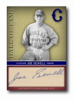
Here is a slightly modified Joe Sewell card. Instead of "Inducted in 1977", perhaps "Induction 1977" is better?

sewell_HOF.jpg

Thanks again.
 

nurvanna

Member
Feb 18, 2009
362
0
phoenix, az
this card looks nice as well.
i'm still partial to "inducted __year__".
i believe someone else mentioned this, the coloring around the slaughter auto should be a little more darker or a deeper yellow to contrast similar to how the sewell's box appears.
just the same, very nice work.
 

200lbhockeyplayer

Active member
Aug 10, 2008
11,049
2
nurvanna said:
this card looks nice as well.
i'm still partial to "inducted __year__".
i believe someone else mentioned this, the coloring around the slaughter auto should be a little more darker or a deeper yellow to contrast similar to how the sewell's box appears.
just the same, very nice work.
I agree.

I need to tweak the colors. Obviously with the yellow in the Athletics, it's going to appear a lot different with the yellowed background around the photo.

The text is just awkward any way you read it, so maybe a simple dash would work...

"INDUCTED - 1977"
or
"INDUCTION - 1977"
 

Craig - 21hawk

New member
Aug 7, 2008
1,514
0
St. Paul, MN
200lbhockeyplayer said:
nurvanna said:
this card looks nice as well.
i'm still partial to "inducted __year__".
i believe someone else mentioned this, the coloring around the slaughter auto should be a little more darker or a deeper yellow to contrast similar to how the sewell's box appears.
just the same, very nice work.
I agree.

I need to tweak the colors. Obviously with the yellow in the Athletics, it's going to appear a lot different with the yellowed background around the photo.

The text is just awkward any way you read it, so maybe a simple dash would work...

"INDUCTED - 1977"
or
"INDUCTION - 1977"

If it were me, I'd definitely go with "INDUCTED - 1977".

Craig
 

Members online

Top