Welcome to our community

Be apart of something great, join today!

Enough, Enough with the Teddy Cut

Your Preference

  • A) Jags ok to preserve the signature

    Votes: 0 0.0%

  • Total voters
    36

Disclaimer: Links on this page pointing to Amazon, eBay and other sites may include affiliate code. If you click them and make a purchase, we may earn a small commission.

hofautos

New member
Aug 29, 2008
6,678
0
Sorry to keep pestering...I just thought I would get more opinions, since this is a pretty pricey card...

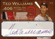
A few people mentioned the jagged cuts, where many seemed ok with it. For me, I understand wanting to get the whole cut in the card, and I have seen knuckles work before, and where at first i didn't like it, but I guess i just kind of warmed up to it after seeing literally 100s of his cuts. But when a few people mentioned it to me, it reminded me of what I first thought when i saw it...

Just curious if you would rather see

A) the entire auto, including the dots, so you are ok with the jagged lines
B) the jagged lines are cool
C) I would rather have a card where the cut consumes half the card so I dont have to see jagged lines
D) Trim the i dots and beginning/end of auto as necessary, so it will fit in a nice smaller rectangle

Example of trimmed signature
!BPCkUTwBGk~$(KGrHgoH-CUEjlLlvzuyBJ)qg-ygjg~~_1.jpg

Example of cut consumes half the card (no room for pics or much)
!BQc,j2w!2k~$(KGrHgoH-DgEjlLl1CLoBJ464+n)0w~~_1.jpg


teddyfront.jpg
 

scotty21690

New member
Aug 7, 2008
16,150
0
I may be in the minority, but I really like the jagged cut window.

1. VERY unique
2. Fits the whole auto, none is cut off
3. Cut doesnt consume the whole card, which leaves more room for the card design and the picture


Just my $.02
 

totran

New member
Mar 25, 2009
241
0
both cut auto pics are just plain ugly.

the only cut auto i would want is one where the whole auto could be seen through a window and all of the edges of document are covered by the window
if these things cant be achieved then the document the auto was cut from should never be used
 

studioclint

New member
Aug 10, 2008
797
0
Chicago
totran said:
both cut auto pics are just plain ugly.

the only cut auto i would want is one where the whole auto could be seen through a window and all of the edges of document are covered by the window
if these things cant be achieved then the document the auto was cut from should never be used

I agree.
 

17ROCKIES12

Active member
Aug 13, 2008
4,208
0
I like the jags.
My suggestion
Getting rid of the dots wouldn't take too much away and would make the cut smaller.
 

hofautos

New member
Aug 29, 2008
6,678
0
WOW, really pretty even right now between all four choices.
Kind of surprised me.
Oversized documents not an option, i collect cards, not posters or 8x10s...Actually I have an 8x10 collection to, but for the sake of this discussion, please keep to cards....

PS - I love my 8x10s too here's one just to keep you guys happy too :D

A document like this could not be cut for autos (grin), now an envelope or 3x5...chop away, FAST!
8x10jones.jpg
 

hofautos

New member
Aug 29, 2008
6,678
0
17ROCKIES12 said:
I like the jags.
My suggestion
Getting rid of the dots wouldn't take too much away and would make the cut smaller.

I actually just emailed knuckles and asked "if not too late", can he show me prototype without jags and dotted i's removed...but it's "probably" too late since I gave my nod to him this morning...so this is all pretty much a mute point, but will consider for future..

You guys just don't know how hard it is to find A NICE auto good for a baseball card...still looking for a mantle...
 

jeremy

New member
Aug 7, 2008
1,917
0
YOU KNOW
everytime i open one of the 20 posts on this card it hurts my eyes

go with a simple layout, get rid of that fuggin 9 and the jaggedy lines, it looks ass
 

G $MONEY$

New member
Feb 8, 2009
14,156
1
Calgary
Not a big fan of the jagged cut window, but i could definitely live with one or two of that style in my PC. Now if he was gonna be making these cuts on a regular basis for me, i would not want them all with a jagged cut like that for sure.
 

wideright

New member
Aug 7, 2008
7,854
0
Just a quick photoshop edit. Rotated the "jersey" and "bat" words, reshaped the cut window, gave it slanted corners for some flair, and voila. I think the card still has a nice look to it. Much more eye-appealing to me and you have the entire cut. Its a nice enough cut that you don't need to crop so tightly around it just so you can see more of the background. That's unnecessary IMO.

teddyfront.jpg

EDIT: added original just for comparison sake.

teddyfront.jpg
 

TNP777

New member
Aug 7, 2008
3,528
1
the 209
I've seen enough of Garret's work to conclude without question that I would blindly accept whatever he was able to produce over anything the card companies have managed to design. Yes the cut is jagged, but he manages to make it flow smoothly with the background images he/the client chooses. I for one cannot stand an incomplete auto fit into a small window or a card that has been butchered up and has an incomplete (or worse an unflattering) background. My least favorite design has to be the "no design" that has become prevelant with Topps, specifically in the Heritage brand. Big window, small border, cut auto, tiny picture of the player. Poor "effort" by the design team.
 

totran

New member
Mar 25, 2009
241
0
MaineMule said:
G $MONEY$ said:
wideright said:

Boom! there ya go, looks great like this, imo.

Wide- you da man!! Very nice!!

yes this is the one i would want ... if i had to nit pick i would cut the window a touch tighter to the auto on the left side to allow a little more meat between the window and edges of card
 

Members online

Top