Welcome to our community

Be apart of something great, join today!

There used to be some great looking sets

Disclaimer: Links on this page pointing to Amazon, eBay and other sites may include affiliate code. If you click them and make a purchase, we may earn a small commission.

Topnotchsy

Featured Contributor, The best players in history?
Aug 7, 2008
9,448
176
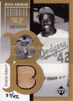
Noticed a card in the eBay wins post that reminded me of some of the great looking sets that came out in the early 00's. The 90's were great for inserts, but the 00's had some awesome looking and innovative game-used (and auto) cards.

Memo to the card, companies, bring back the guys who designed some of these sets.

!Bv63OEgCGk~$(KGrHqR,!g4Ev1+0C1w(BMGl4zK+7g~~_3.jpg

!Bz2-jfQ!Wk~$(KGrHqN,!hMEw5FOsQF9BM(0YydIuQ~~_12.jpg

!B)rFR+Q!mk~$(KGrHqN,!h8Ew5JRJ79iBMOhu1E8!!~~_12.jpg
 

200lbhockeyplayer

Active member
Aug 10, 2008
11,049
2
I like the top two, but the bottom doesn't work for me.

The problem is that the card companies appear to be stuck with a few standard themes and styles now, and a few adjustments later...it's then a new year, new product.
 

Topnotchsy

Featured Contributor, The best players in history?
Aug 7, 2008
9,448
176
200lbhockeyplayer said:
I like the top two, but the bottom doesn't work for me.

The problem is that the card companies appear to be stuck with a few standard themes and styles now, and a few adjustments later...it's then a new year, new product.
The bottom one is a little more "cartoony" but I still think it is a cool look.

Further, the sets back then actually had interesting themes (at times.) As you know (but I'll point out for those who might not) top one was a ***** League set and the bottom (obviously) a set based on the Rookie of the Years.

When was the last time something that was put put looked like it required thought?
 

nevermore

Well-known member
Aug 7, 2008
3,371
516
New York
Companies are trying too hard with the modern GU sets. Too many little windows and cutouts just ruin the card for me. It is okay to have little boxes when using a variety of GU items but having the exact same jersey in each window is lame.

(not mine)
!Bz2k1+gBmk~$(KGrHqUOKjkE)O8-1CC+BM(y4P3ptw~~_12.jpg


Sets such as these had just one window and looked far better. Autograph aside, the Koufax is one of the nicest looking GU cards.

pongu04clippings.jpg


(not mine)
!BzCPskgCWk~$%28KGrHqZ,!i4Ew5KTSpEWBMUNQUms7!~~_12.jpg
 

bouwob

Active member
Administrator
Aug 7, 2008
4,612
0
Companies are trying too hard with the modern GU sets. Too many little windows and cutouts just ruin the card for me. It is okay to have little boxes when using a variety of GU items but having the exact same jersey in each window is lame.


The cutout significantly help reduce patch faking. They are good for the hobby.
 

nevermore

Well-known member
Aug 7, 2008
3,371
516
New York
Smaller cut-outs may be tamper proof but the card still looks cramped and ill designed whether it has a patch or not.

Cards with the nicer patches as the Ultimate, Sterling, or Sweet Spot Jumbos, which are the main targets of forgers can still easily be faked. Companies maybe winning the battle with fakers but they are still losing the war.
 

Topnotchsy

Featured Contributor, The best players in history?
Aug 7, 2008
9,448
176
bouwob said:
Companies are trying too hard with the modern GU sets. Too many little windows and cutouts just ruin the card for me. It is okay to have little boxes when using a variety of GU items but having the exact same jersey in each window is lame.


The cutout significantly help reduce patch faking. They are good for the hobby.
While this is true in some situations, what a lot of sets have are a few tiny little game-used pieces so that the company does not have to use more material and yet it's a "quad game-used."
 

boomo

Active member
Sep 14, 2008
4,298
2
just picked up a HUGE 2005 donruss and leaf collection, and it was amazing how many different things were in there. Guy had actually completed a master set of 2005 leaf. 20 different proof colors, duals, triples, #ed inserts galore. Ripping was fun with donruss a few years ago.
 

gracecollector

Well-known member
Aug 7, 2008
6,559
215
Lake in the Hills, IL
I think the most annoying trend in modern sets is smaller player photography, as the companies devote a lot of negative space for the jersey and autographs.

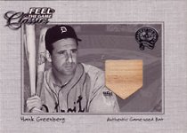
This set looked great to me. Much like the Stitches in Time:
greenberg01FG.jpg

Nowadays, you get a lot of sets like this:
!B0PzTW!BWk~$(KGrHqZ,!i4Ew5KTSpEWBMZf2HwJlQ~~_35.jpg

Small player photo tucked in a corner, with too much space devoted to nothing. I hate this look. The bigger the player photo, the better IMO.
 

JoshHamilton

Well-known member
Aug 7, 2008
12,205
320
I know I'm going to get absolutely crucified for this, but I don't care.

I think the designs of beloved DLP products from 2001-2005 generally sucked.

There's way too much going on in most of the designs. Even the famous TOTT Ruth jumbo...bland white stock, a bunch of random blue lines, and the colorization of Ruth looks cartoonish at best. Prime Patches...poor design, tiny b/w headshot, a bunch of empty space. Leaf Limited was cool, but the foilboard makes it look cheap. That high end product that came in BGS slabs...Icons maybe? They spelled out all kinds of crap. M-l-b, H-O-F, etc.

I like classic designs that showcase the photo. Gold foil is ok, just don't overdo it by making the entire card foil. That Sterling Rivera card is really nice. Donruss had some great patches, but their designs just scream 'cheap.' just computer generated design after computer generated design. Panini is doing the same damn thing
 

Topnotchsy

Featured Contributor, The best players in history?
Aug 7, 2008
9,448
176
JoshHamilton said:
I know I'm going to get absolutely crucified for this, but I don't care.

I think the designs of beloved DLP products from 2001-2005 generally sucked.

There's way too much going on in most of the designs. Even the famous TOTT Ruth jumbo...bland white stock, a bunch of random blue lines, and the colorization of Ruth looks cartoonish at best. Prime Patches...poor design, tiny b/w headshot, a bunch of empty space. Leaf Limited was cool, but the foilboard makes it look cheap. That high end product that came in BGS slabs...Icons maybe? They spelled out all kinds of crap. M-l-b, H-O-F, etc.

I like classic designs that showcase the photo. Gold foil is ok, just don't overdo it by making the entire card foil. That Sterling Rivera card is really nice. Donruss had some great patches, but their designs just scream 'cheap.' just computer generated design after computer generated design. Panini is doing the same damn thing
I never cared for the designs of 2005 Playoff Absolute including the jumbo jerseys either.
 

Members online

Top