- Thread starter
- #1
You are using an out of date browser. It may not display this or other websites correctly.
You should upgrade or use an alternative browser.
You should upgrade or use an alternative browser.
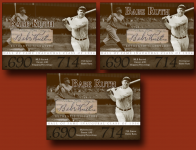
Latest custom - BABE Ruth STyle - POLL
- Thread starter hofautos
- Start date
Disclaimer: Links on this page pointing to Amazon, eBay and other sites may include affiliate code. If you click them and make a purchase, we may earn a small commission.
- Thread starter
- #2
- Thread starter
- #3
69MetsFan
Active member
IMHO the cut shouldn't cover any of the images of Babe Ruth. It should be the center piece and be accentuated by the pictures.
wolfmanalfredo
Active member
I voted for bottom, but when the page refreshed and I looked again, by far the right one looks classic
uniquebaseballcards
New member
- Nov 12, 2008
- 6,783
- 0
I liked the one on the right too. Do the stats make the card too busy/are they too big?
blitzerlover
Active member
- Aug 9, 2008
- 6,523
- 0
I like the top right one the most.
wolfmanalfredo
Active member
uniquebaseballcards said:I liked the one on the right too. Do the stats make the card too busy/are they too big?
I think it adds some charactor to the card, would look lacking without something there imo
- Thread starter
- #9
uniquebaseballcards said:I liked the one on the right too. Do the stats make the card too busy/are they too big?
you have to realize the cards are blown up, and the font is not that big.
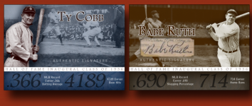
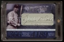
The cobb is already made, and it looks great...i will show an actual scan of finished cobb in actual size in a moment.
That said, regardless if you think it is big or not, it will be same size as cobb.
- Thread starter
- #10
Krom
New member
The one on the right.
hoopster3977
New member
My opinion also.69MetsFan said:IMHO the cut shouldn't cover any of the images of Babe Ruth. It should be the center piece and be accentuated by the pictures.
Ralph
A_Pharis
Active member
I picked top left. If it is going to be displayed next to the Cobb then the design should mirror the design of the Cobb. Having the Cobb cut right-aligned will make a center-aligned Ruth cut look "off". If they were displayed apart -- the opinion may be different. Just not when they are right next to each other.
Krom
New member
Thats a good point, + the cut is right below the name (Cobb) as is the one on the left.A_Pharis said:I picked top left. If it is going to be displayed next to the Cobb then the design should mirror the design of the Cobb. Having the Cobb cut right-aligned will make a center-aligned Ruth cut look "off". If they were displayed apart -- the opinion may be different. Just not when they are right next to each other.
- Thread starter
- #15
A_Pharis said:I picked top left. If it is going to be displayed next to the Cobb then the design should mirror the design of the Cobb. Having the Cobb cut right-aligned will make a center-aligned Ruth cut look "off". If they were displayed apart -- the opinion may be different. Just not when they are right next to each other.
This is my thinking also, but dont quite like the way it feels like the font has to be squeezed below ruths face.
I am thinking to remove the "ghost ruth pic" all together so the cut and name will breathe better.
A_Pharis
Active member
Just see if you can find an era-accurate stadium shot to put behind it instead of the ghosted Ruth pic.
Topnotchsy
Featured Contributor, The best players in history?
- Aug 7, 2008
- 9,452
- 182
A consideration. Do you want "Career .690 Slugging Percentage" as opposed to .690 Career Slugging Percentage?"
mwheeler27
New member
- Mar 6, 2009
- 669
- 0
I chose the right one as well.
Both of those cards are beautiful! Well done.
Both of those cards are beautiful! Well done.
- Thread starter
- #19
mwheeler27 said:I chose the right one as well.
Both of those cards are beautiful! Well done.
Thanks...the credit goes to 200lbhockeyplayer!
- Thread starter
- #20
Topnotchsy said:A consideration. Do you want "Career .690 Slugging Percentage" as opposed to .690 Career Slugging Percentage?"
Good thought, let me think on that one.
Similar threads
- Replies
- 11
- Views
- 1K
- Replies
- 2
- Views
- 1K


