Welcome to our community

Be apart of something great, join today!

New panini Prizm pics

Disclaimer: Links on this page pointing to Amazon, eBay and other sites may include affiliate code. If you click them and make a purchase, we may earn a small commission.

BBCgalaxee

Well-known member
Joined
Sep 9, 2011
Messages
6,475
Reaction score
60
Looks even better now!
 

Attachments

  • 1396900578896.jpg
    1396900578896.jpg
    52.1 KB · Views: 120
  • 1396900589612.jpg
    1396900589612.jpg
    85.9 KB · Views: 123
  • 1396900612156.jpg
    1396900612156.jpg
    58.3 KB · Views: 114
  • 1396900621720.jpg
    1396900621720.jpg
    80.2 KB · Views: 122
  • 1396900631152.jpg
    1396900631152.jpg
    53.8 KB · Views: 118

BBCgalaxee

Well-known member
Joined
Sep 9, 2011
Messages
6,475
Reaction score
60
More
 

Attachments

  • 1396900983371.jpg
    1396900983371.jpg
    57.7 KB · Views: 99
  • 1396900997024.jpg
    1396900997024.jpg
    58 KB · Views: 105
  • 1396901007552.jpg
    1396901007552.jpg
    57.2 KB · Views: 113
  • 1396901015263.jpg
    1396901015263.jpg
    72 KB · Views: 114

rsmath

Active member
Joined
Nov 8, 2008
Messages
6,086
Reaction score
1
Looks even better now!

don't care much for colored parallels (although they do sell decently when I bust some boxes), but I like prizm because it's the best use of chrome in the trading card industry now that topps has phoned it in with their topps chrome and bowman chrome cards.

edit: what is up with the "y" on "Machado" part of the auto? Are we supposed to know Manny Machado as "Machado Manny"? ;)
 
Last edited:

bcubs

Member
Joined
Apr 8, 2009
Messages
658
Reaction score
0
Location
Springfield, IL
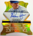
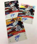
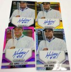
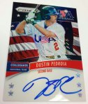
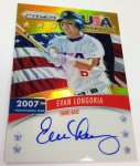
Getting tired of the same cropping of the hats. Early on it seemed like a good way to get around the logo thing and it was okay. Now I'm done with a bunch of half headed pics.
 

MrMet

Well-known member
Joined
Apr 6, 2010
Messages
13,556
Reaction score
612
Location
The Poconos
Would look better with logos and team names

I mean...Los Angeles on the Trout card? I know everyone knows its the Angels, but LA also has the Dodgers....

Yeah, someone might think the Dodgers started wearing red
 

Pine Tar

Active member
Joined
Mar 1, 2009
Messages
27,702
Reaction score
15
Location
Oswego,Illinois
Not bad. But I hate when they cut off someones head or hat on a card then it looks like it was cut wrong in the machine yuck
 

Super Mario

Well-known member
Joined
Mar 1, 2009
Messages
18,403
Reaction score
254
Location
Mushroom Kingdom
Man, Adobe has come a long way in their baseball card design capability.


Those look awful.


Who wastes their money on this crap?
 

jbhofmann

Active member
Joined
Mar 12, 2009
Messages
6,914
Reaction score
2
Location
Indiana
I guess I'll comment on the obvious that nobody else will, USA Stuff looks gorgeous.
 

fordman

Well-known member
Joined
Feb 22, 2013
Messages
3,191
Reaction score
37
Location
Ohio
The Good: the cards themselves look Great! Colorful and all chromey! On card auto plus the TEAM USA looks great.

The Bad: the die cut pattern. I think the die cuts are a little too much. I wasn't much for Topps die cuts in Series 2 last year either.

I will buy a box!

Fordman

Sent from my DROID4 using Freedom Card Board mobile app
 

Austin

Well-known member
Joined
Aug 7, 2008
Messages
5,708
Reaction score
44
Location
Dallas, Texas
Not bad. But I hate when they cut off someones head or hat on a card then it looks like it was cut wrong in the machine yuck
I agree. They look like a set of miscut cards. Would be a nice set otherwise.
MLB is ruining baseball cards with its exclusive license.
 

BBCgalaxee

Well-known member
Joined
Sep 9, 2011
Messages
6,475
Reaction score
60
Yeah, the chopping of heads gets tired but when you're handcuffed, there's limitations.

It's still better looking than the cereal cards from the 80s with blank hats.

Sent from my HTCONE using Freedom Card Board mobile app
 

SINFULONE

Active member
Joined
Sep 26, 2008
Messages
5,691
Reaction score
0
Yeah, the chopping of heads gets tired but when you're handcuffed, there's limitations.

It's still better looking than the cereal cards from the 80s with blank hats.

Sent from my HTCONE using Freedom Card Board mobile app

I have some of those King B discs with blank uniforms and hats.Loved King B.
 

DeliciousBacon

Well-known member
Joined
Apr 23, 2011
Messages
3,444
Reaction score
95
Location
Warwick, RI
I agree. They look like a set of miscut cards. Would be a nice set otherwise.
MLB is ruining baseball cards with its exclusive license.

I have my doubts as to whether Panini would do much better if they had a license.

These previews look good and all, but why not show the Kelly Johnson autos that surely fall 1 per box, as with most Panini products?
 

Members online

Top