Welcome to our community

Be apart of something great, join today!

Card Appreication 101

Disclaimer: Links on this page pointing to Amazon, eBay and other sites may include affiliate code. If you click them and make a purchase, we may earn a small commission.

nevermore

Well-known member
Aug 7, 2008
3,371
516
New York
Some of you may have taken Art Appreciation in college. The purpose of the class is to analyze and understand various paintings through the ages to find and understand the meaning or see the beauty inherent in the work of art. Well, here is a Card Apprecation thread...

Many times, we open the bubble mailer, briefly look at the card and then tuck it away in a box, binder or shoebox where it never sees the light of day. For me, lately it has been all about eye appeal. I've only bought four autographs over the past year, and traded for three more. I try only to pick up a few select cards which really call out to me, not because they are rare or are the product-hit, but because they are so perfect, that I must have them.

Let's see your masterpieces, any why you love them.

These two are my favorites:

1. 1996 Fleer - This base card is worth close to nothing, but I'll take it over the shiny refractors, superfractors and parallels. Such a simple design with a card stock which is ideal for autographs. It depicts a young Rivera at the start of his career in a gritty pose, with his signature delivery. The signature is a perfect and crisp example of his early auto, circa 1996. He signed it in the lighter portion of the card, over the infield dirt, to allow the signature to stand out. Yet it is signed in the perfect spot on the bottom right above his printed name embossed in gold, as if he was signing a letter.

96fleer.jpg


2. 2006 Bowman Heritage - This one could be in a museum next to Warhol's Mariyln or Che. An iconic pose of Rivera, which is enhanced visually with the three-tone spot color. Has a crisp signature from later in his career. Just like Rivera's pitch location, his signature placement is impeccable. Starting below his collar and just above his glove, right on the white portion of the card. Anywhere else, and the colors would have clashed. This is a perfect example of his signature from later in his career, far different that the one above, much sleeker and toned down, but not sloppy or rushed from all the years of signing.
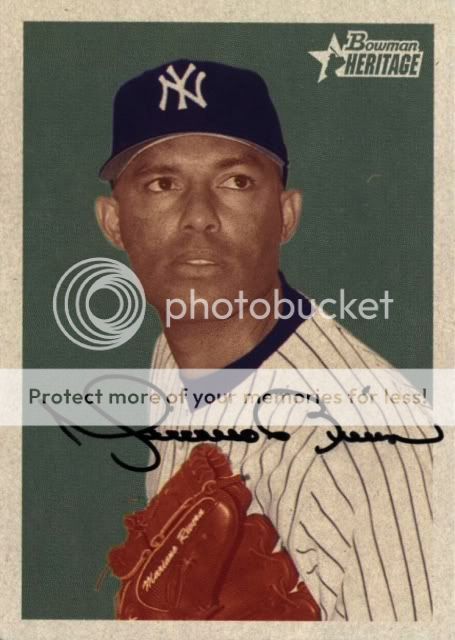
rivera.jpg
 
Last edited:

MansGame

Active member
Sep 25, 2009
15,324
20
Dallas, TX
Just so you know... this is the advertisement I had to view after your pictures took me away from FCB and to your photobucket...

ImageUploadedByFreedom Card Board1389155799.251157.jpg

In case you care to change your settings...

photobucket_zps1370f8d6.jpg
 

mrmopar

Member
Jan 19, 2010
6,204
4,133
Many of my non-certified autos are selected with card image in mind. I am a huge fan of the 70s/80s action shots and enjoy getting those cards signed. Doug Ault for example is one of my favorites, although I got lazy and just stole a scan from google. This card just screams cool to me, with the Rookie cup, nice mix of dirt and grass and major Thurman Munson cameo.


metallicalex777

Super Moderator
Aug 7, 2008
13,904
117
Seattle, Wa
For me I would have to go with these ones:

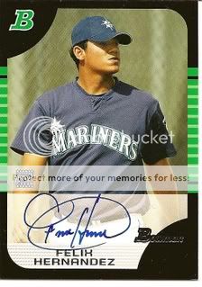
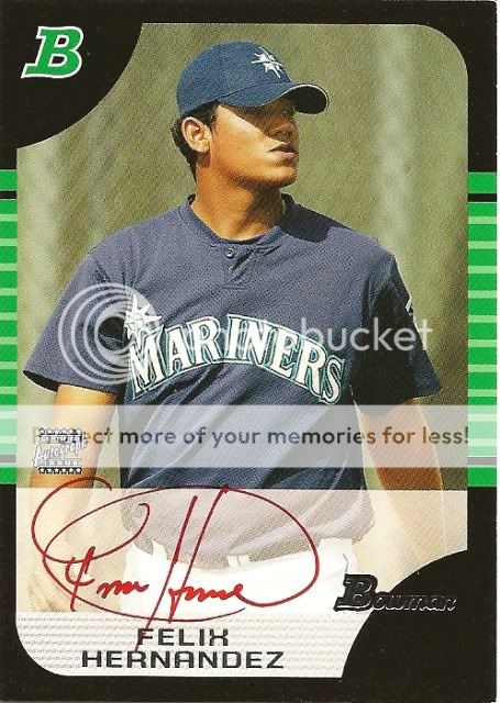
2005 Bowman Felix Hernandez blue ink and red ink autograph. I have a ton of Felix stuff but this is on the paper/non chrome card which "simplifies" it as well as being a non sticker and an earlier autograph it shows why I started collecting him back in 2005 before he became the King he is today. When I first started collecting him it was for two reasons being his awesome circular signature as well as being on my beloved Mariners. The base blue auto keeps it nice and simple and the red ink puts enough pizzazz without throwing off the card:
T5.jpg
Felixredauto.jpg


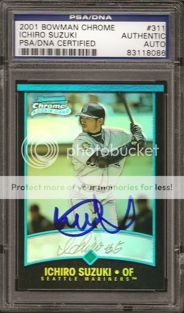
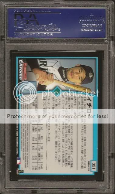
2001 Bowman Chrome Ichiro international refractor autograph. I'm usually not a fan of IP autographs but these REALLY stand out as nearly a piece of art (I know, tough to do with a chrome card). These were signed by Ichiro at Mill Creek when they had his contract up until Leaf took it over. To this day this is one of my favorite cards as the blue autograph really pops on the refractor surface:
august24ichirofront.jpg
august24ichiroback.jpg
 

Zan

Active member
Aug 12, 2008
3,067
0
NY, NY
For me it has to be this one, great idea for a thread by the way, love seeing these


joey12508

Well-known member
Aug 7, 2008
38,655
16,305
Winterfell
This to me was almost a impossible card to find at the time. I always thought it was so unique and a great design.
 

ASTROBURN

Active member
Jun 23, 2011
4,576
0
Santa Cruz, CA
This has always been one of my favorite cards. Part of a larger picture with other players connecting like a puzzle, i have never seen the entire image. But i dont need to. The imagery here showing Bags mid swing and the shuttle taking off from his bat just looks like he launched one into outer space. Its a nice nod to Houston, combining both baseball and the Space Center.

anyhow, ive loved this card from its first release, and aside from one of ones and 93 refractors it remains tops in my favorites column.

1995%20Fleer%20Pro-Visions%203.jpg
 

weight333

New member
May 28, 2013
581
0
Milwaukee, WI
1994 Leaf Gamers

One of my favorites. Full bleed, borderless photography with a great portrait shot of Bonds. His facial expression is intense and intimidating, as most fans remember him. The Giants cap and gold crossing earring are Bonds' signature style. The flashy gold nameplate is a great transition from the classic full bleed photography.

images
 

WoundedDuck

Active member
Aug 23, 2008
2,904
2
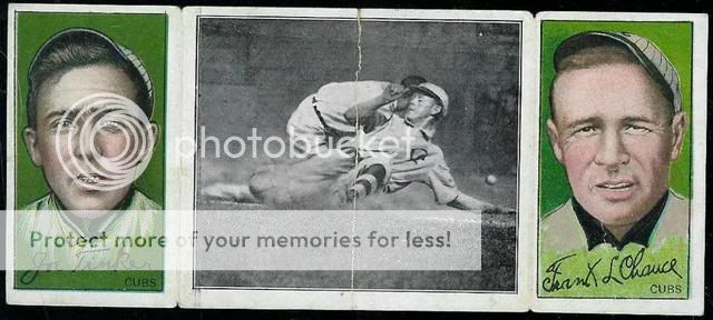
I love T202s


I'd eventually like to add the one with Cobb sliding in the middle to my collection.
 

nevermore

Well-known member
Aug 7, 2008
3,371
516
New York
mrmopar - Great looking card! I just put my 70s Yankees team sets into a binder this week, was a blast looking thru them. So many great photographs.

metallicalex777 - Alex, Felix has a really nice early autograph. I love that Ichiro card, had both versions at one point. The autograph makes it that much sweeter. No fading or spotting on his auto either, like many of his UD cards.

Zan - great looking vintage card, I am partial to it since orange is my favorite color. I'll have to see if there are any Yankees from the set.

joey12508 - Iconic set, the Bernie is still a tough one after all these years, an SP I believe. Would love to own one someday.

ASTROBURN - Great choice, makes Bagwell look like a superhero from one of the Marvel cards from that era.

weight333 - Simple yet stunning design. Can't believe I've never seen that set before. I had to look it up on COMC, too bad no Yankees.

KLARNOLD - Love the AS design from that year too. Unique photo, definitely makes it memorable.

WoundedDuck - Those are masterpieces. Way ahead of their time.

Enjoyed seeing the responses so far.
 

Brewer Andy

Active member
Aug 10, 2008
9,634
21
Just always loved this shot. Makes ya wanna go to the cages and take video game swings. The Platinumed background makes the photo pop in person


Zan

Active member
Aug 12, 2008
3,067
0
NY, NY
Zan - great looking vintage card, I am partial to it since orange is my favorite color. I'll have to see if there are any Yankees from the set.

the only one I know of is the Lou Gehrig, which goes for upwards of $3k each time I've seen it. highly desired card. It's a 1936 Wheaties Series 3
 

gracecollector

Well-known member
Aug 7, 2008
6,559
215
Lake in the Hills, IL
2012 Leaf Best of Baseball Babe Ruth Sketch Card by Artist Tempy Moore

$T2eC16N,!)0FIZPRcSs8BSN4R)vhy!~~60_57.JPG


Now I know what you're going to say... was this card drawn by a 4-year old? You, my friend, are sadly mistaken. Tempy Moore's rendition of the Babe is pure genius, reflecting a depth of understanding of her subject matter few others possess. Those deep shadows under his eyes? An artistic reference to Babe's hard-charging, hard-drinking approach to life. The confused expression? A metaphor of the conflicted confusion of his childhood years, as Babe wrestled with the question of why he was given up for adoption. Lack of ear details? Babe turning a deaf ear to his critics and doing it his way. Curly hair and eyebrows? Babe's hair was straight, so the daring Moore chose to put the Babe in jerry curls to represent the end of the era of white players exclusivity in MLB that the Babe represents. The two reflections in his eyes? A subtle reference to his two wives, the two lights of his life. The pointed downward shadow of the nose on an otherwise rounded-nose Ruth? Moore's bold political statement of the Babe looking down his nose at the roid users who would later break his homerun records.

In the card's monochromatic leaden color scheme, we are reminded of the Yankees uniform and echoes of a bygone time. The gray shadowing is simplistically rendered in tones reminiscent of the Depression era. In the childlike style of the written name of Ruth, we recall the Babe's unique joy of playing ball - where he could find personal escape and assume the "big kid" persona that he felt most comfortable being.

Clearly Tempy Moore is both a visionary and a historian. Her portrayal of Babe Ruth on this landmark issue will surely stand the test of time and is the epitome of a card that takes several viewings to be fully appreciated. Spend some time gazing at this card today, slowly peeling back the layers of its complexity to gain a greater insight into the Babe, baseball and ultimately life itself.
 
Last edited:

Members online

Latest posts

Top