Welcome to our community

Be apart of something great, join today!

2021 Topps Preview image released

Disclaimer: Links on this page pointing to Amazon, eBay and other sites may include affiliate code. If you click them and make a purchase, we may earn a small commission.

nevermore

Well-known member
Aug 7, 2008
3,371
516
New York
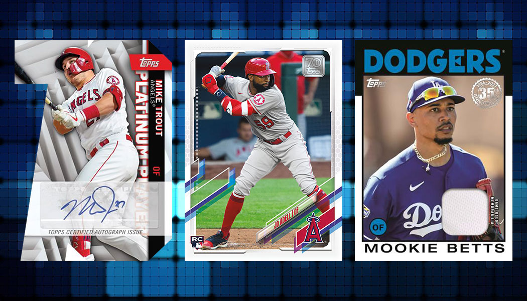
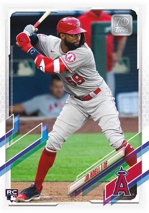
Beckett posted Topps 2021 preview.

First thought was it looks Donruss-y. I don't understand the purple and blue colors with the Angels. I do like the 70th anniversary logo though.

Curious to hear everyone's thoughts?


2021-Topps-Series-1-Baseball-Jo-Adell-1.jpg
 

rsmath

Active member
Nov 8, 2008
6,086
1
I like how some of the elements are see thru so you get more of the picture where those elements intrude.

I do worry about player safety with those xacto knife blade graphic elements threatening to cut the players in the image.

i hope the topps 70 logo element will be silver foil stamped.
 

linuxabuser

Well-known member
Jan 16, 2011
2,364
50
Hoping the print run won’t be ridiculous. I may actually order a case of S1.
 

Philip J. Fry

Well-known member
Aug 9, 2008
5,778
404
Ohio
Definitely thought of Donruss at first glance. Much, much better than the 2019 design, and I love having full borders back.
 

Randy Shields

Well-known member
Aug 20, 2008
2,224
441
OH-IO
I agree with the purple and blue colors not matching up with team colors. That's kind of odd. Otherwise the cards don't look that bad imo.
I'm wondering if they have some redemptions or other anniversary type ideas like they did in 2011.
 

Therion

Well-known member
Nov 19, 2008
5,787
398
Looooooosiana!
It feels a lot more like Panini than Topps, which is a negative in my mind. Weirdly, I feel like Topps Big League is becoming the set that is more of what Topps flagship should look like.
 

smapdi

Well-known member
Aug 7, 2008
4,397
221
I have to say I don't hate it but it doesn't look like a base Topps design to me. I didn't like this year's design but it has grown on me. This is even more unfocused and thrown-together-looking. But I'm glad to have full borders back and as usual it'll look sweet in chrome. But I'm going to be floating on a 1972 Heritage high all year so won't bother me.
 

Members online

Latest posts

Top