- Thread starter
- #1
You are using an out of date browser. It may not display this or other websites correctly.
You should upgrade or use an alternative browser.
You should upgrade or use an alternative browser.
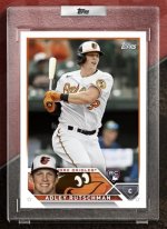
'23 Topps design released...
- Thread starter gt2590
- Start date
Disclaimer: Links on this page pointing to Amazon, eBay and other sites may include affiliate code. If you click them and make a purchase, we may earn a small commission.
First design I've really liked since 2013. I was wondering if they'd echo the 1963 design again like they did in 83 and 03, and it is there, kinda, with the small portrait in the corner below a full action shot. I like the logo and the legible font choices.
mrmopar
Member
- Jan 19, 2010
- 6,226
- 4,189
Yawn.
George K
Well-known member
Oy vey! The design looks sloppy to me, but I suppose we better get used to looking at it now.
Oy vey! The design looks sloppy to me, but I suppose we better get used to looking at it now.
I’m confused, sloppy how? Seems to me it’s about as clean as it could be
Sent from my iPhone using Freedom Card Board mobile app
George K
Well-known member
To me, it looks like a draft of a design. Like it needs another pass. Also, it looks quite a bit like some of the most recent designs.I’m confused, sloppy how? Seems to me it’s about as clean as it could be
Sent from my iPhone using Freedom Card Board mobile app
As a Topps collector, I like the mirroring of the 1963, 1983, and 2003 designs with the smaller player. The bottom element reminds me of an info bubble during an ESPN broadcast or sports center.
However, I don't like the execution and I also find it sloppy for a few reasons
1. They made the team logo too big. The Oriole's eyes are larger than the player's and detracts from the surrounding design elements.
2. Team name is cut off, goes behind the player's face. They could have incorporated it better. Either directly above/underneath the player's name.
3. Too many competing elements on the bottom, one eyes are pulled in too many directions. The position font should be smaller than the player's name.
4. If the player is wearing a cap with the logo already on there, the large logo next to it becomes redundant. Perhaps having an action shot, facsimile autograph, or stadium shot to fill that space would work better.
Austin
Well-known member
I agree with all of that. Nice idea and the homage to 1963, 1983 and 2003 is great, but the bottom is too busy, the team name is cut off and the logo is too big and distracting. At least it’s not boring like most Topps designs of the past ten years.As a Topps collector, I like the mirroring of the 1963, 1983, and 2003 designs with the smaller player. The bottom element reminds me of an info bubble during an ESPN broadcast or sports center.
However, I don't like the execution and I also find it sloppy for a few reasons
1. They made the team logo too big. The Oriole's eyes are larger than the player's and detracts from the surrounding design elements.
2. Team name is cut off, goes behind the player's face. They could have incorporated it better. Either directly above/underneath the player's name.
3. Too many competing elements on the bottom, one eyes are pulled in too many directions. The position font should be smaller than the player's name.
4. If the player is wearing a cap with the logo already on there, the large logo next to it becomes redundant. Perhaps having an action shot, facsimile autograph, or stadium shot to fill that space would work better.
mrmopar
Member
- Jan 19, 2010
- 6,226
- 4,189
The Orioles bird eyes are distracting. Would like to see a different team logo to see if that is what is turning me off about this card.
George K
Well-known member
Same here. There had to be another way to incorporate the team mascot better than that. As is, looks like a poor cropping job.The Orioles bird eyes are distracting. Would like to see a different team logo to see if that is what is turning me off about this card.
Super Mario
Well-known member
Better than the trash they’ve had in recent years. Sick of all the swirly ****.
Sent from my iPhone using Freedom Card Board mobile app
Sent from my iPhone using Freedom Card Board mobile app

