Yanks2151
Active member
- Nov 9, 2013
- 3,231
- 8
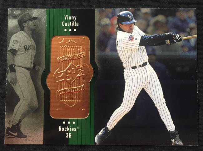
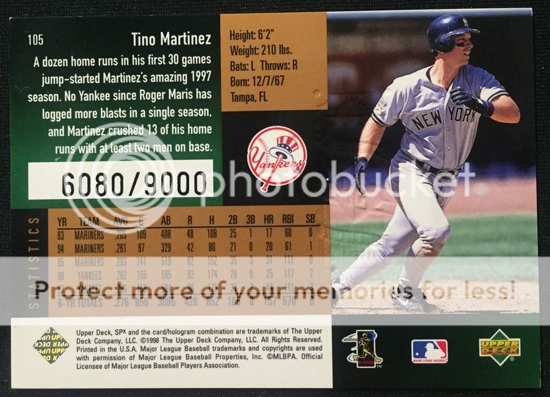
Here is one that's a head scratcher. 1998 UD SPx Vinny Castilla pictured on front and the back is Tino Martinez and its serial numbered. You wonder how many in that run are like this. How does this even happen.


") Normal on the left, bold on the right.
Normal on the left, bold on the right.