
- Thread starter
- #1
Well the sticker autograph has been around for approximately a decade or so and I while I typically shoot for on card autographs for my PC, there are certain sticker autographs that I find suitable for my PC.
The below items have all been pulled off eBay and none of them are my items, they are just being used to showcase the sticker used for the autograph:
o7FqBS,sZRIKEw~~60_57.JPG")
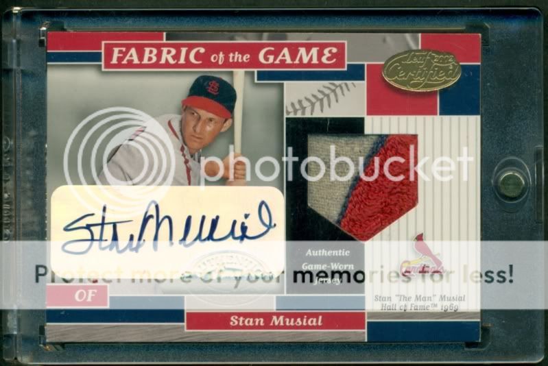
In my opinion, this is possibly the best sticker that has been used because of its size to fit full autographs, and non-glossiness properties. These stickers are best suited on a lighter background.

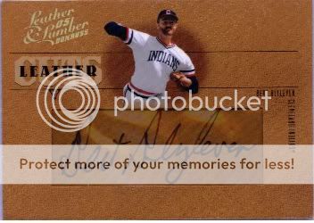
The earlier Donruss stickers, which were a solid light color and typically a dark black autograph could be placed on almost any card and look pretty solid, irrespective of the background being light or dark.
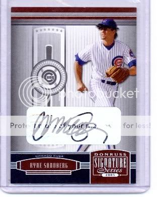
However, the early Donruss stickers usually looked better with the rounded corners as opposed to the cut-out effect:

Unfortunately, the now unlicensed brand carries these clear stickers, which in my opinion are less attractive than the earlier solid color counterparts:

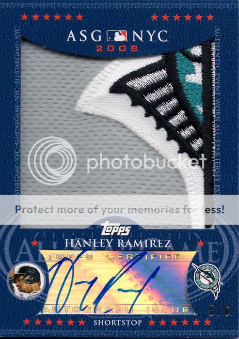
One thing that Topps has always been the worst at is producing nice looking sticker autographs. Only certain sets can pull off their current reflective silver sticker well (shiny/glossy finished products), while the majority just look like crap:

and while it has been toned down recently to a more transparent sticker, I still just can not stand the text and design accompanying the sticker:

Luckily, these two tones did not last too long either:

As far as Upper Deck, they've had some really down moments:

I was never able to understand why companies would add so much background noise to the autograph surface...all it does is take away from the autograph.
While these are not ideal, Upper Deck still ended up doing a decent job with the non-glossy clear sticker autographs...at least they tried to create a background to complement the card, despite falling a little short on both ends.

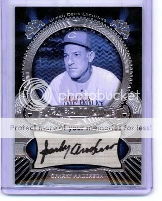
[MENTION=1948]Leaf[/MENTION] 's approach has been along the right path, at least they only use clear stickers, although if they were a little larger like the EX stickers from my first example and perhaps fit the card better (with a border approach or maybe a little larger of a sticker to cover the entire white portion of the card) they would be in the top 2:

The one thing we can be thankful for is not having to deal with sticker autographs like these bad boys:

Overall, while on-card is king, when I think about buying a card with a sticker autograph I try finding the visually appealing stickers. In my opinion, the early Donruss stickers that are fully displayed and not cut-out along with the larger clear non-glossy stickers are the two best the hobby has seen.
I know I definitely missed a few variations, so please share your favorite/least favorite stickers of all time!
The below items have all been pulled off eBay and none of them are my items, they are just being used to showcase the sticker used for the autograph:
In my opinion, this is possibly the best sticker that has been used because of its size to fit full autographs, and non-glossiness properties. These stickers are best suited on a lighter background.
The earlier Donruss stickers, which were a solid light color and typically a dark black autograph could be placed on almost any card and look pretty solid, irrespective of the background being light or dark.
However, the early Donruss stickers usually looked better with the rounded corners as opposed to the cut-out effect:
Unfortunately, the now unlicensed brand carries these clear stickers, which in my opinion are less attractive than the earlier solid color counterparts:
One thing that Topps has always been the worst at is producing nice looking sticker autographs. Only certain sets can pull off their current reflective silver sticker well (shiny/glossy finished products), while the majority just look like crap:
and while it has been toned down recently to a more transparent sticker, I still just can not stand the text and design accompanying the sticker:
Luckily, these two tones did not last too long either:
As far as Upper Deck, they've had some really down moments:
I was never able to understand why companies would add so much background noise to the autograph surface...all it does is take away from the autograph.
While these are not ideal, Upper Deck still ended up doing a decent job with the non-glossy clear sticker autographs...at least they tried to create a background to complement the card, despite falling a little short on both ends.
[MENTION=1948]Leaf[/MENTION] 's approach has been along the right path, at least they only use clear stickers, although if they were a little larger like the EX stickers from my first example and perhaps fit the card better (with a border approach or maybe a little larger of a sticker to cover the entire white portion of the card) they would be in the top 2:
The one thing we can be thankful for is not having to deal with sticker autographs like these bad boys:
Overall, while on-card is king, when I think about buying a card with a sticker autograph I try finding the visually appealing stickers. In my opinion, the early Donruss stickers that are fully displayed and not cut-out along with the larger clear non-glossy stickers are the two best the hobby has seen.
I know I definitely missed a few variations, so please share your favorite/least favorite stickers of all time!
")

