Welcome to our community

Be apart of something great, join today!

Ugly ICONIC cards

Disclaimer: Links on this page pointing to Amazon, eBay and other sites may include affiliate code. If you click them and make a purchase, we may earn a small commission.

BBCgalaxee

Well-known member
Sep 9, 2011
6,475
59
There's obviously no shortage of ugly cards, but how about ugly iconic cards?

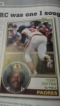
Here's my vote, not because of the design, but because of the picture.

Not only is it a shot if Gwynn's rear, but you also can't really see his face. It's also just an awkward looking photograph.

On top of that, as it turns out, Tony became more known for his hitting than running (if this was a Henderson card, that's different) and he isn't wearing his iconic uniform number.

How about you all?
 

Attachments

  • 1406648392488.jpg
    1406648392488.jpg
    66.5 KB · Views: 42

matfanofold

Active member
Aug 10, 2008
7,645
1
The 1986 Topps Terry Pendleton became iconic simply because of its uglyness, so that gets my vote.

Sent using Freedom Card Board mobile app
 

gracecollector

Well-known member
Aug 7, 2008
6,559
215
Lake in the Hills, IL
Personal opinion, but I think Jeter's iconic RC is UGLY. Don't like the design or especially his facial expression. Don't like the huge amount of foil taking away the color of the background. He deserved better!

$_57.JPG
 

fordman

Well-known member
Feb 22, 2013
3,190
32
Ohio
Personal opinion, but I think Jeter's iconic RC is UGLY. Don't like the design or especially his facial expression. Don't like the huge amount of foil taking away the color of the background. He deserved better!

$_57.JPG

In 1993, the more foil, the more better. Sold more foil cards than base, didn't matter what player. When you opened a pack and saw foil, you saw $$$.

Fordman

Sell me your Jay Bruce cards!
 

carlitoson

Active member
Aug 7, 2008
1,813
0
Following the theme of the original post, David Wright's 2002 chrome auto is the same way and the 1990 Leaf Sosa is bad because it shows one of the greatest homerun hitters of all time bunting.
 

BBCgalaxee

Well-known member
Sep 9, 2011
6,475
59
Between Wright's bowman, bowman chrome, bowman heritage and total, he has a bunch of ugly cards using the same "ass" pic.

Granted, his topps pristine cards look the best technology wise, but it's his prospect premiers which has the best photo by far.

And just a note about the premiers card, the photo was taken in 2001 obviously and he is wearing a Mets Jersey.....with a 2000 World Series patch.
 

goobmcnasty

Active member
Apr 4, 2014
1,583
13
Griffey's 1998 Crusade. Beautiful card, but it is a picture of him finishing a swing after getting fooled on a pitch. You can almost see the foul pop up down the third base side.
 

Brewer Andy

Active member
Aug 10, 2008
9,634
21
Jose-Canseco.jpg


TEENAGE MOUSTACHE!!!!
IT'S ONLY TEENAGE MOUSTACHE!!!

Are you serious Clark? That's one of the coolest looking cards of all time! Even with the lip fuzz the contrast of colors is awesome. I loved most cards that showed those A's gold BP jerseys
 

hive17

Active member
Aug 7, 2008
21,426
24
The "Senior photo shoot" rookie pictures from 90s Topps (I'm looking at YOU Mariano Rivera).
 

gt2590

Super Moderator
Aug 17, 2008
38,784
3,410
Near Philly
The '81 Topps Rickey is pretty bad too. For a while, 2nd year cards did well, but yuk!

But I've always thought the '73 Schmidt RC was particularly bad, and not just 'cuz it has two other players. Just awful looking, in all aspects IMO...
 

BBCgalaxee

Well-known member
Sep 9, 2011
6,475
59
The pete rose rc is pretty ugly come to think of it.

Sent from my HTCONE using Freedom Card Board mobile app
 

Members online

Latest posts

Top