Welcome to our community

Be apart of something great, join today!

First Look: 2015 Topps Baseball Designs and Set Size Released

What are your thoughts about the 2015 Topps Baseball Design and Expanded Set Size?


  • Total voters
    19
  • Poll closed .

Disclaimer: Links on this page pointing to Amazon, eBay and other sites may include affiliate code. If you click them and make a purchase, we may earn a small commission.

James52411

New member
Administrator
May 22, 2010
4,531
0
Tallahassee, FL
Chris Olds and the folks at Beckett have the first look at the 2015 Topps baseball set. One thing I like is that the set is a little bigger this year, with the first series containing 350 cards.

Here is Chris' full article.

Beckett News » First look: 2015 Topps baseball cards

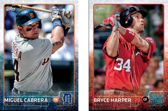
Here's the the base design. Go ahead and vote on what you think of the 2015 design and the expanded set.

2015Topps-base-cards.jpg
 

Austin

Well-known member
Aug 7, 2008
5,706
41
Dallas, Texas
Finally a border other than white or black. I like the colors, but the team name and some logos are hard to see.
It will be nice opening packs with all the color cards. Usually it's just a bunch of same-looking white cards and a colorful insert or two.

Did Topps unveil its next year design much earlier this year? I don't recall seeing the upcoming set being shown during the summer.
 

James52411

New member
Administrator
May 22, 2010
4,531
0
Tallahassee, FL
I'm hoping they get rid of the silver foil on the names. Tough to read, and the only reason they did it was to give the cards a slightly more "premium" look in the early 1990s, when having foil on a card was actually kind of a big deal.
 

gmarutiak

Active member
Jul 23, 2010
1,386
2
Baltimore, MD
If the border had the color at the top, then faded into white at the bottom, the words would be a lot easier to read. Other than that, I like it.
 

mrmopar

Member
Jan 19, 2010
6,223
4,179
I don't care for the look, but I won't be buying them anyway, so Topps couldn't give a rip about what I think. Call me old fashioned, but give me some cooler graphic features like the 65 Topps pennant or the block team names of 77 Topps or the circular 2nd photo of 83 Topps. I am not asking for a re-do of those sets, but more creative that this. I find the dull (91-93 Topps dull) and the printed team names blend in to the color area.
 

rsmath

Active member
Nov 8, 2008
6,086
1
love the design, skeptical on the expanded set size because it'll probably be 20 players who won gold gloves/silver sluggers or players who fans heard or field mics caught farting in the middle of a game in 2014 rather than adding 20 more players to the checklist such as top pinch-hitters or relievers/setup men who never get a card in a MLB release other than their rookie cards and if they go from setup to top-tier closer or starter where they get their own cards again.
 

Members online

Latest posts

Top