Welcome to our community

Be apart of something great, join today!

2017 Topps Series 1 - design revealed

Disclaimer: Links on this page pointing to Amazon, eBay and other sites may include affiliate code. If you click them and make a purchase, we may earn a small commission.

TNP777

New member
Joined
Aug 7, 2008
Messages
3,528
Reaction score
1
Location
the 209
http://www.cardboardconnection.com/2017-topps-series-1-baseball-cards

2017-Topps-Series-1-Baseball-Base-kershaw.jpg


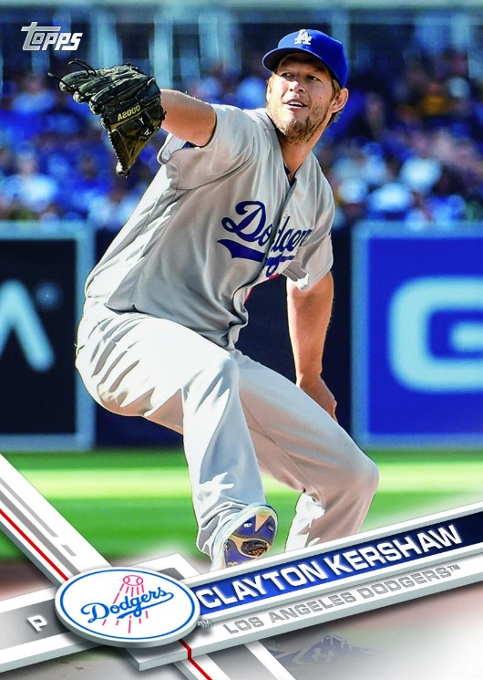
I think I like it, although it's not terribly different from the past couple years.
 

Brewer Andy

Active member
Joined
Aug 10, 2008
Messages
9,634
Reaction score
21
It's pretty clean. I think I actually like it a lot. It does look a bit like an Opening Day insert though. Will be interesting to see how they mix in parallels and Chrome with that design but my initial reaction is thumbs up. Better version of the last couple years


Sent from my iPhone using Tapatalk
 

mouschi

Featured Contributor, Bridging the Gap, Senior Mem
Joined
May 18, 2012
Messages
3,141
Reaction score
234
I like it! I think Topps has done a great job moving things forward in terms of design.
 

PeteD

Active member
Joined
Oct 15, 2009
Messages
2,175
Reaction score
17
Location
Southern Ont.
At least with the full bleed design you don't have borders to worry about.
 

gradedeflator

Active member
Joined
Mar 31, 2011
Messages
1,389
Reaction score
20
Personally not a fan. Prefer 2015 amongst last 3 years. 2016 still eh but I like more than 2017.
 

Therion

Well-known member
Joined
Nov 19, 2008
Messages
5,870
Reaction score
597
Location
Looooooosiana!
It reminds me of an Upper Deck design but I can't put my finger on which set it was.
 

rsmath

Active member
Joined
Nov 8, 2008
Messages
6,086
Reaction score
1
if topps went back to etched chrome, the chrome version of this design would look awesome!
 

hive17

Active member
Joined
Aug 7, 2008
Messages
21,426
Reaction score
24
I kind of like borders, so I'm torn. It's clean and all, but I like the base set to have borders and you can get creative with the other stuff.

I'm not saying it looks bad, just maybe not what I want in my base Topps.
 

fordman

Well-known member
Joined
Feb 22, 2013
Messages
3,191
Reaction score
37
Location
Ohio
I really like this design. It's modern era design really gives it an up to date feel.

It reminds me of an Upper Deck design but I can't put my finger on which set it was.

It does kinds remind me of UD Xponential a little bit.

08UDXP3AR.jpg


angelsX6.jpg


Looks like Stadium Club-ish to me. Happy to see less filters thou!

I agree, save the filters for inserts.


Topps is really doing themselves a favor by doing away with the drab plain white stock bordered cards that they done for years. I have also noticed that for the last two years, Topps has been using a thinner paper stock for base so that could be a big factor of why the white bordered cards are going to the way side.

Fordman
 
Last edited:

Members online

Latest posts

Top