- Thread starter
- #1
BostonIdol
New member
- Mar 8, 2019
- 193
- 2
There's nothing like fooling around with customs to make one think deeper about a card design or an entire set. When you look through an entire set and start trying to apply the designs, you quickly bump into the same challenges that dogged the original designers and start to understand why they made certain decisions and how the set evolved. Topps 1969 football set is a good example.
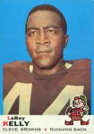
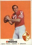
At a high level, the cards feature a player image with the background cropped out mounted on a solid colored background, with an identification bar at the bottom containing the usual name, position, and team city and name. The team logo also appears straddling the identification bar. Some cards are full bleed, meaning the solid colored background runs edge to edge, while others have a white frame around the background. If you guessed these cards are from different series, you are right. Series one had full bleed. Series two had the white frame.
 .
. 
One of the oddities in this design is the way the player image is cropped inside the solid background, which makes it look like the player was cropped, rather than looking like the player image was framed. The Dave Wilcox card provides a particularly obvious example of how odd this cropping looks.
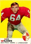
The style doesn't make much sense from an artistic standpoint, but if you think about mass production, you can probably guess the reason. Cards were printed on large sheets and then cut into individual cards. Having a solid color around the border, whether a full bleed background or a white frame, provided tolerance for cards to be less obviously wrong when the cuts were off. There would be no tolerance for off centered cuts if the player photos ran all the way to the edge. A sample from an uncut sheet confirms that theory.
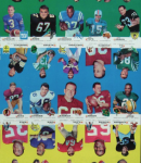
You can see the Wilcox card (upside down) in the middle of the yellow row, so the cropping appears to be padding for off centered cuts. I'm guessing someone at Topps saw the results and didn't like them, hence the change to the white frame approach in series two. There were other subtle changes as well. In series one (LeRoy Kelly), the first name is centered above the last name, but the last name is left justified to the card, leaving a large white space between the names and the team logo. In series two (John Brodie), the first name is still centered above the last name, but the last name is centered in the white space between the edge of card and the logo. Overall the series two design feels like it makes more sense since both names are now center justified. Perhaps if both the first and last names had been left justified, one could argue that they were a counterweight to the logo, but that would still leave a lot of white space in the middle of the card.
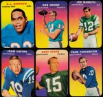
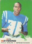
Topps approach to football and basketball cards during this era was often underwhelming. It felt like they were ten years behind Topps' baseball designs, as if they were farmed out to a junior employee. Variations in the background color and logo placement (some are actually on the left) could be defended as part of the design, but the information presentation was inconsistent, too. In the 1969 football set, team names and positions are often truncated, sometimes in different ways even for the same position on the same team.
 .
.  .
. 
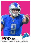
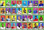
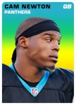
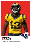
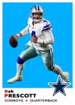
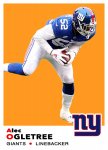
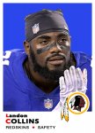
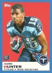
Topps brought this design back in 2013 with some changes. The obvious change was coloring the entire frame to indicate retail affiliation with Target (red) and Walmart (blue). A more subtle change was left justifying the first name, last name, and team name to present a more consistent look than the centered names, albeit with more white space in the middle.
 .
.  .
. 
I'm personally not a fan of creating relatively arbitrary variations to promote scarcity, but I don't make my living printing or selling cards.
Thanks!
At a high level, the cards feature a player image with the background cropped out mounted on a solid colored background, with an identification bar at the bottom containing the usual name, position, and team city and name. The team logo also appears straddling the identification bar. Some cards are full bleed, meaning the solid colored background runs edge to edge, while others have a white frame around the background. If you guessed these cards are from different series, you are right. Series one had full bleed. Series two had the white frame.
 .
. 
One of the oddities in this design is the way the player image is cropped inside the solid background, which makes it look like the player was cropped, rather than looking like the player image was framed. The Dave Wilcox card provides a particularly obvious example of how odd this cropping looks.

The style doesn't make much sense from an artistic standpoint, but if you think about mass production, you can probably guess the reason. Cards were printed on large sheets and then cut into individual cards. Having a solid color around the border, whether a full bleed background or a white frame, provided tolerance for cards to be less obviously wrong when the cuts were off. There would be no tolerance for off centered cuts if the player photos ran all the way to the edge. A sample from an uncut sheet confirms that theory.

You can see the Wilcox card (upside down) in the middle of the yellow row, so the cropping appears to be padding for off centered cuts. I'm guessing someone at Topps saw the results and didn't like them, hence the change to the white frame approach in series two. There were other subtle changes as well. In series one (LeRoy Kelly), the first name is centered above the last name, but the last name is left justified to the card, leaving a large white space between the names and the team logo. In series two (John Brodie), the first name is still centered above the last name, but the last name is centered in the white space between the edge of card and the logo. Overall the series two design feels like it makes more sense since both names are now center justified. Perhaps if both the first and last names had been left justified, one could argue that they were a counterweight to the logo, but that would still leave a lot of white space in the middle of the card.
Topps approach to football and basketball cards during this era was often underwhelming. It felt like they were ten years behind Topps' baseball designs, as if they were farmed out to a junior employee. Variations in the background color and logo placement (some are actually on the left) could be defended as part of the design, but the information presentation was inconsistent, too. In the 1969 football set, team names and positions are often truncated, sometimes in different ways even for the same position on the same team.
 .
.  .
. 
Topps brought this design back in 2013 with some changes. The obvious change was coloring the entire frame to indicate retail affiliation with Target (red) and Walmart (blue). A more subtle change was left justifying the first name, last name, and team name to present a more consistent look than the centered names, albeit with more white space in the middle.
 .
.  .
. 
I'm personally not a fan of creating relatively arbitrary variations to promote scarcity, but I don't make my living printing or selling cards.
Thanks!
Last edited:


