- Thread starter
- #1
You are using an out of date browser. It may not display this or other websites correctly.
You should upgrade or use an alternative browser.
You should upgrade or use an alternative browser.
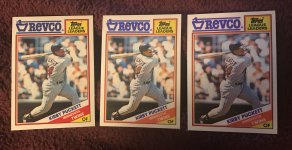
1988 Topps Revco variation
- Thread starter tpeichel
- Start date
Disclaimer: Links on this page pointing to Amazon, eBay and other sites may include affiliate code. If you click them and make a purchase, we may earn a small commission.
K34PuckettAddict
Well-known member
- May 28, 2009
- 668
- 276
Good stuff and very similar to the pink variation on the ‘91 US Playing Cards for sure. Nailed the comparison. The blue is different across the three and the ones on the right almost look like a larger font due to the pink highlights. The red on the card in the middle almost looks orange. I personally love these sorts of oddballs.
Sent from my iPhone using Freedom Card Board mobile app
Sent from my iPhone using Freedom Card Board mobile app
- Thread starter
- #3
There do seem to be gradations of pink shading. Some look like a pink highlighter went over the entire blue text while others look like the pink was carefully applied around each letter.Good stuff and very similar to the pink variation on the ‘91 US Playing Cards for sure. Nailed the comparison. The blue is different across the three and the ones on the right almost look like a larger font due to the pink highlights. The red on the card in the middle almost looks orange. I personally love these sorts of oddballs.
Sent from my iPhone using Freedom Card Board mobile app
Similar threads
- Replies
- 2
- Views
- 872
- Replies
- 3
- Views
- 279

