- Thread starter
- #1
You are using an out of date browser. It may not display this or other websites correctly.
You should upgrade or use an alternative browser.
You should upgrade or use an alternative browser.
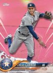
2018 topps cards look sharp to me
- Thread starter bongo870
- Start date
Disclaimer: Links on this page pointing to Amazon, eBay and other sites may include affiliate code. If you click them and make a purchase, we may earn a small commission.
madbull34
Well-known member
Looks nice but without borders it's going to be hard distinguishing between colored parallels.
psj
Active member
Actually, the colored parallels look good
psj
Active member
Brewer Andy
Active member
- Aug 10, 2008
- 9,634
- 21
olerud363
Active member
I like the base design, except for the wavy thing that partially covers the team logo and player name.
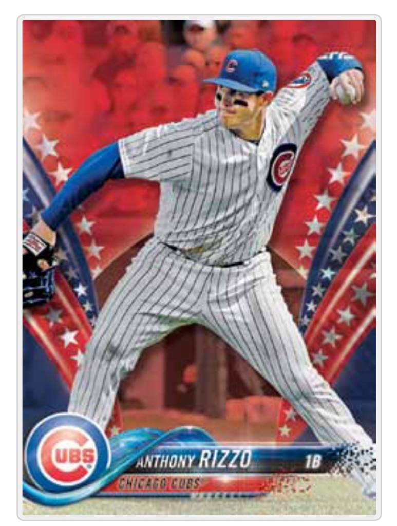
The color parallels I don't care for at all, based on the pink example. I don't like how they wash out the background with color. The Independence Day parallel is just too much of an assault on the eyes.
Sent from my [device_name] using Freedom Card Board mobile app
The color parallels I don't care for at all, based on the pink example. I don't like how they wash out the background with color. The Independence Day parallel is just too much of an assault on the eyes.

Sent from my [device_name] using Freedom Card Board mobile app
MrMet
Well-known member
I like the base design, except for the wavy thing that partially covers the team logo and player name.
[/url]
+1
Sent from my iPhone using Freedom Card Board
gt2590
Super Moderator
I like the few parallels I've seen
But I do wonder how that wavy bar will translate to Chrome...
But I do wonder how that wavy bar will translate to Chrome...
RagingAcid
Member
Base looks really ugly to me... idk
nosterbor
Well-known member
They look to busy!
madbull34
Well-known member
Oh wow. So they're making the whole background colored. Would be interesting to see how they turn out in chrome.
Austin
Well-known member
I really don't like the wave, especially how it covers part of the first letter.
Besides the wave and logo, the two banners look too much like 1992 Fleer Ultra (a beautiful set, but too similar, even down to the small first name, and larger last name)

Besides the wave and logo, the two banners look too much like 1992 Fleer Ultra (a beautiful set, but too similar, even down to the small first name, and larger last name)

I ran across some blasters last night and grabbed three. At first I saw two rainbow foil. When I looked back through them I saw a gold. Nothing else really special. Tons of inserts.
7 - 1983's
13 - Derek Jeter Highlights
2 - Home Run Challenge
9 - Legends in the Making
5 - MLB Awards
20 - MLB Opening Day
3 - Players Weekend Patch, 1 Gold
4 - Superstar Sensations
2 - Topps Now Top 10
8 - Topps Salute
Base Jaso

Gold Polanco

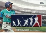
Players Weekend Patch
Cano
Rosario

Tanaka Gold /50

7 - 1983's
13 - Derek Jeter Highlights
2 - Home Run Challenge
9 - Legends in the Making
5 - MLB Awards
20 - MLB Opening Day
3 - Players Weekend Patch, 1 Gold
4 - Superstar Sensations
2 - Topps Now Top 10
8 - Topps Salute
Base Jaso

Gold Polanco

Players Weekend Patch
Cano

Rosario

Tanaka Gold /50

Yeah, that waterslide has to go. I also immediately thought of the 1992 Ultra. I'm torn on the parallels, I like they are easy to distinguish but they are also visually difficult to process. Those patches will be difficult to distinguish between base and gold for the casual fan, so those could end up on eBay mismarked frequently.
psj
Active member
I ran across some blasters last night and grabbed three. At first I saw two rainbow foil. When I looked back through them I saw a gold. Nothing else really special. Tons of inserts.
7 - 1983's
13 - Derek Jeter Highlights
2 - Home Run Challenge
9 - Legends in the Making
5 - MLB Awards
20 - MLB Opening Day
3 - Players Weekend Patch, 1 Gold
4 - Superstar Sensations
2 - Topps Now Top 10
8 - Topps Salute
Base Jaso
View attachment 76675
Gold Polanco
View attachment 76676
Players Weekend Patch
Cano
View attachment 76677
Rosario
View attachment 76678
Tanaka Gold /50
View attachment 76679
Any interest in moving that Tanaka?
Sure shoot me a PM. We'll work something out.Any interest in moving that Tanaka?
Sent from my [device_name] using Freedom Card Board mobile app
clarkzac
Well-known member
- Oct 31, 2010
- 10,030
- 1,405
Those Player's Weekend patches are just screaming to be signed above the patch if you ask me.
Sent from my [device_name] using Freedom Card Board mobile app
Sent from my [device_name] using Freedom Card Board mobile app
Brewer Andy
Active member
- Aug 10, 2008
- 9,634
- 21
Those Player's Weekend patches are just screaming to be signed above the patch if you ask me.
Sent from my [device_name] using Freedom Card Board mobile app
There are indeed auto parallels exactly like that
Sent from my iPhone using Freedom Card Board
AnthonyCorona
Well-known member
Just went over the checklist again. Topps makes a set of Topps Now hahaha
Sent from my LG-H811 using Tapatalk
Sent from my LG-H811 using Tapatalk


