- Thread starter
- #1
BostonIdol
New member
- Mar 8, 2019
- 193
- 2
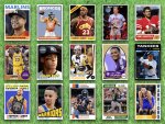
For years I dreamed of Topps reprinting their old sets using modern techniques. When Heritage came along I was excited, but it seems like a blown opportunity. Someone at Topps couldn't do math, so designs are weirdly 49th anniversary. Someone else thought crummy old photos were cool, so they used bad digital filter to approximate old photos and printing techniques in a way that looks fraudulent. And I wouldn't mind paying extra for high numbers if I could field a starting lineup, but even that test is routinely failed. So I started making my own. Not just a few inserts, but entire sets.
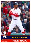
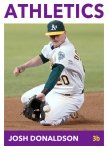
2014 baseball was the first set, based on the 1964 design, but with some action shots mixed in. I stuck with the original colors, which I later regretted. It seems like when Topps adds new teams, they try to align with team colors rather than choosing the bizarre contrasting colors they used in the sixties and seventies.
 .
.  .
. 
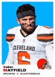
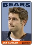
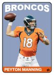
2015 football was the next set. Topps Huddle brought back the 1965 football design for a limited run and I thought it would be interesting to apply it to a larger set. I took a more aggressive approach to design, normalizing the "tall boy" to a normal 3.5 by 2.5 aspect ratio and using complimentary colors.
 .
.  .
. 
In 2016, I wanted to do a basketball set. Of course Topps didn't do a basketball issue in 2016, so I used the baseball design, which was pretty generic.
 .
.  .
. 
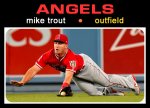
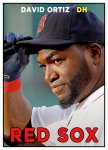
In 2017, I got to do my favorite baseball design of the sixties. Sourcing images proved more challenging than I expected because there should be some space at the top if you don't want the name covering the hat or face. I went with complimentary colors, which caused some readability issues due to low contrast, but I think Topps faced the same challenge which is why all team names were neon yellow in the 1969 set.
 .
.  .
. 
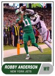
2018 was back to football, with an update on the classic Topps design from 1968.
 .
.  .
. 
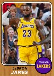
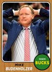
That was going to be it, but with LeBron moving to Los Angeles, I had to do another basketball set. Again nothing from Topps for basketball in 1968, other than a short run black and white proof of concept set, so I took the 1968 baseball design and replaced the burlap or whatever, that was so hideous Topps scrapped it mid-set, and replaced it with hardwood.
 .
.  .
. 
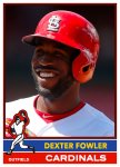
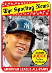
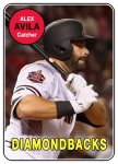
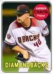
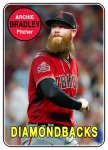
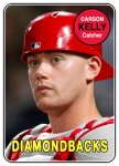
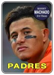
in 2019, I plan to do my first hockey set, but meanwhile, I decided to do a baseball set as well. I'm not a big fan of the 1969 design with the cramped name badge cramping the player photo and all the team names being the same color. It was a notoriously bad set for photos too, with the combination of outdated photos and expansion teams leading to a lot of BHNH (big head, no hat) shots and early proto-airbrushing jobs that looked more like blacking out the cap with a sharpie. Funny thing is that doing a set reveals the good and bad of any format, and the format wasn't all bad.
 .
.  .
. 
Until now, I've just been "collecting" these cards for myself, but I'm trying to figure out if they are worth sharing, and if so, the best way to do it. The sets are literally hundreds of cards, with the 2019 baseball set raising the bar to 777 cards (25 cards per team, including managers, plus 21 SN all stars and 6 postseason cards).
So I thought I would post some arrogant criticisms of Topps (their failures in trying to capture the 1972 design suggest they use Fiverr to staff designers) and some samples from my sets and see if anyone thought they were interesting. Thanks for reading!
Frank
2014 baseball was the first set, based on the 1964 design, but with some action shots mixed in. I stuck with the original colors, which I later regretted. It seems like when Topps adds new teams, they try to align with team colors rather than choosing the bizarre contrasting colors they used in the sixties and seventies.
 .
.  .
. 
2015 football was the next set. Topps Huddle brought back the 1965 football design for a limited run and I thought it would be interesting to apply it to a larger set. I took a more aggressive approach to design, normalizing the "tall boy" to a normal 3.5 by 2.5 aspect ratio and using complimentary colors.
 .
.  .
. 
In 2016, I wanted to do a basketball set. Of course Topps didn't do a basketball issue in 2016, so I used the baseball design, which was pretty generic.
 .
.  .
. 
In 2017, I got to do my favorite baseball design of the sixties. Sourcing images proved more challenging than I expected because there should be some space at the top if you don't want the name covering the hat or face. I went with complimentary colors, which caused some readability issues due to low contrast, but I think Topps faced the same challenge which is why all team names were neon yellow in the 1969 set.
 .
.  .
. 
2018 was back to football, with an update on the classic Topps design from 1968.
 .
.  .
. 
That was going to be it, but with LeBron moving to Los Angeles, I had to do another basketball set. Again nothing from Topps for basketball in 1968, other than a short run black and white proof of concept set, so I took the 1968 baseball design and replaced the burlap or whatever, that was so hideous Topps scrapped it mid-set, and replaced it with hardwood.
 .
.  .
. 
in 2019, I plan to do my first hockey set, but meanwhile, I decided to do a baseball set as well. I'm not a big fan of the 1969 design with the cramped name badge cramping the player photo and all the team names being the same color. It was a notoriously bad set for photos too, with the combination of outdated photos and expansion teams leading to a lot of BHNH (big head, no hat) shots and early proto-airbrushing jobs that looked more like blacking out the cap with a sharpie. Funny thing is that doing a set reveals the good and bad of any format, and the format wasn't all bad.
 .
.  .
. 
Until now, I've just been "collecting" these cards for myself, but I'm trying to figure out if they are worth sharing, and if so, the best way to do it. The sets are literally hundreds of cards, with the 2019 baseball set raising the bar to 777 cards (25 cards per team, including managers, plus 21 SN all stars and 6 postseason cards).
So I thought I would post some arrogant criticisms of Topps (their failures in trying to capture the 1972 design suggest they use Fiverr to staff designers) and some samples from my sets and see if anyone thought they were interesting. Thanks for reading!
Frank

