Laxcat
New member
- Sep 6, 2013
- 264
- 0
I've been out of the hobby for quite some time but to me they look like the love child of 1990 Bowman and those horrible Topps All Star sets that were glossy.

Disclaimer: Links on this page pointing to Amazon, eBay and other sites may include affiliate code. If you click them and make a purchase, we may earn a small commission.
Let's hope Franco does not have a "First" logo b/c he will be in BC!


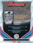
Blue wave & Black wave refractor hot packs....hmmmmmm
Jumbo pack out?
Sent from my Galaxy Nexus using Freedom Card Board mobile app
Parallels include basic Refractors (#/500), Blue Refractors (#/250), Black Refractors (#/99), Green Refractors (#/75), Gold Refractors (#/50), Orange Refractors (#/25), Red Refractors (#/5), Printing Plates and Superfractors (1/1).
With so many parallels at /99 and lower... it just kills the value of the Blue Refractors.
Just locked in a few of each. Like the 1/1 ratio
Sent from my Galaxy Nexus using Freedom Card Board mobile app
With everyone complaining about the borders. Doesn't it make sense to make the borders bigger to highlight the color parallels that ultimately drive the product? Just a thought.
Is that why jumbo pre sells are only $115 a box? Isn't it usually more?