- Thread starter
- #1

You are using an out of date browser. It may not display this or other websites correctly.
You should upgrade or use an alternative browser.
You should upgrade or use an alternative browser.
Prizm
- Thread starter MGiuseffi
- Start date
Disclaimer: Links on this page pointing to Amazon, eBay and other sites may include affiliate code. If you click them and make a purchase, we may earn a small commission.
Bob Loblaw
Active member
The fact that they're ugly cards?
The fact that there's no MLB Logo (This was obviously going to be the case).
The fact that there are "RCs" that aren't RCs?
The fact that this is a 2012 product being issued over 100 days into 2013?
The fact that there's no MLB Logo (This was obviously going to be the case).
The fact that there are "RCs" that aren't RCs?
The fact that this is a 2012 product being issued over 100 days into 2013?
- Thread starter
- #3
goldenegg1
New member
- Aug 7, 2008
- 4,100
- 0
This may be the first big fail of 2013, or 2012 or whatever year Panini wants it to be.
Hell it is so late in 2013, I'm expecting Prestige 2014 to come out next week.
Hell it is so late in 2013, I'm expecting Prestige 2014 to come out next week.
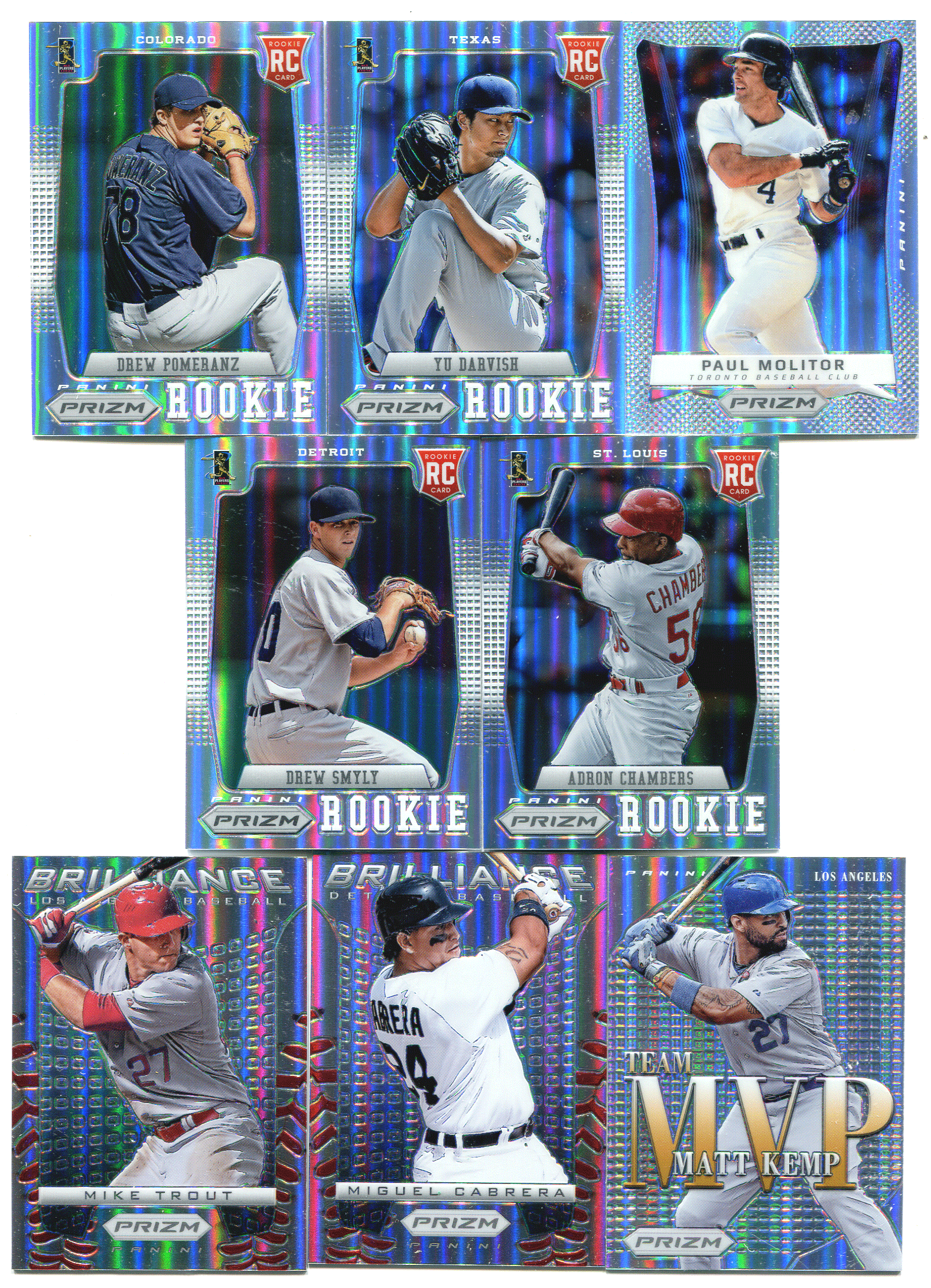
Is that colored etching I see on the baseball stitches? 
BowmanChromeAddict
New member
.Is that colored etching I see on the baseball stitches?
No. That's just colored chrome. The etching is normal refractorish color.
- Thread starter
- #9
Personally, I don't think a card can be too shiny. Just my opinion. I like my shinys... The Seaver Gold #/10 I pulled is a real stunner. So, there are some nice things about this release. One of my pet peeves is collation. Let's just say, Panini has yet to master the "art of collation"...Sigh
Overall, I give the product a C+. With Panini not having to pay MLB, I was hoping this product would have more money put into content. Sadly, I was mistaken.
Overall, I give the product a C+. With Panini not having to pay MLB, I was hoping this product would have more money put into content. Sadly, I was mistaken.
predatorkj
Active member
- Aug 7, 2008
- 11,871
- 2
Dude, I actually think those look really cool. Not having an MLB license sucks because of the lack of logos but the cards aren't bad looking.
joey12508
Well-known member
so many doggie downers on here. if you dont like the product dont buy it.
HPC
New member
I don't think the cards are ugly but the fact that it's called a 2012 release is disgusting
I like them, theyre nice but being 2012 is stupid. Just like Topps and them releasing 2012 Turkey Red Football.
No logo on hats kinda stinks!
Sent from my iPad using Freedom Card Board mobile app
Nothing they can do about it.
Bob Loblaw
Active member
Both Elite Extra and National Treasures don't have logos and NT was a 2012 release that came out in 2013. But why is everyone ok with those?
Allen
NT was done very well with cut off hats.
Elite and no logos has been around for years.
goldenegg1
New member
- Aug 7, 2008
- 4,100
- 0
so many doggie downers on here. if you dont like the product dont buy it.
Yeah, how dare us discuss a product on a sports card message board!