- Thread starter
- #1
You are using an out of date browser. It may not display this or other websites correctly.
You should upgrade or use an alternative browser.
You should upgrade or use an alternative browser.
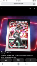
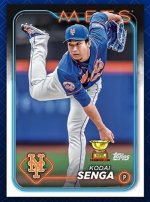
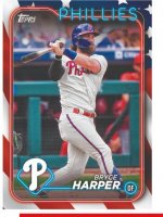
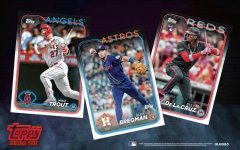
Topps 2024 design
- Thread starter gt2590
- Start date
Disclaimer: Links on this page pointing to Amazon, eBay and other sites may include affiliate code. If you click them and make a purchase, we may earn a small commission.
Dazed
Well-known member
mrmopar
Member
- Jan 19, 2010
- 6,223
- 4,180
I don't mind these.
nosterbor
Well-known member
I like them.
Dilferules
Well-known member
I wonder how they are going to do the parallels...like for Gold cards will the black border towards the top be gold instead, or will the white space be gold so it's got a black/gold thing going on, or will they just make the whole border gold?
- Thread starter
- #6
gt2590
Super Moderator
Decent
- Thread starter
- #8
gt2590
Super Moderator
Therion
Well-known member
WAY better than the 2023 design.
Philip J. Fry
Well-known member
It’s not bad, just curious as to what took them so long to release the design? Isn’t it usually around August/September?
Yes, they usually debut the design months ahead of time, but I expect things will change with Fanatics taking over fully and working out their own planning and scheduling. They do seem to favor holding all info until the last minute, though.
I like the design quite a bit. Something about it makes me think it was a design intended to be used for something other than the flagship set, but I like it anyway. The neon sign type of border is a fun way to include team colors. And I imagine it lends itself well to special printing or chrome versions. And I'm super happy they put some effort into what I presume is the Independence /76 design after a couple years of looking like Donruss. I regret not chasing the 2018 parallel set but might undertake it this year.
I like the design quite a bit. Something about it makes me think it was a design intended to be used for something other than the flagship set, but I like it anyway. The neon sign type of border is a fun way to include team colors. And I imagine it lends itself well to special printing or chrome versions. And I'm super happy they put some effort into what I presume is the Independence /76 design after a couple years of looking like Donruss. I regret not chasing the 2018 parallel set but might undertake it this year.
Dazed
Well-known member
The first thing I thought of was I bet this will look nice as a chrome card!Yes, they usually debut the design months ahead of time, but I expect things will change with Fanatics taking over fully and working out their own planning and scheduling. They do seem to favor holding all info until the last minute, though.
I like the design quite a bit. Something about it makes me think it was a design intended to be used for something other than the flagship set, but I like it anyway. The neon sign type of border is a fun way to include team colors. And I imagine it lends itself well to special printing or chrome versions. And I'm super happy they put some effort into what I presume is the Independence /76 design after a couple years of looking like Donruss. I regret not chasing the 2018 parallel set but might undertake it this year.
Dazed
Well-known member
Checklist: https://www.beckett.com/news/2024-topps-series-1-baseball-cards/#top
I wonder what's going on with Cardboard Connection? They haven't updated 2024 S1 since they originally posted. No pics of the cards or a checklist.
I wonder what's going on with Cardboard Connection? They haven't updated 2024 S1 since they originally posted. No pics of the cards or a checklist.
Philip J. Fry
Well-known member
Yes, they usually debut the design months ahead of time, but I expect things will change with Fanatics taking over fully and working out their own planning and scheduling. They do seem to favor holding all info until the last minute, though.
I like the design quite a bit. Something about it makes me think it was a design intended to be used for something other than the flagship set, but I like it anyway. The neon sign type of border is a fun way to include team colors. And I imagine it lends itself well to special printing or chrome versions. And I'm super happy they put some effort into what I presume is the Independence /76 design after a couple years of looking like Donruss. I regret not chasing the 2018 parallel set but might undertake it this year.
I forgot Fanatics owns Topps now.
- Thread starter
- #16
gt2590
Super Moderator
Borderless variations? I like it!
Checklist up too...
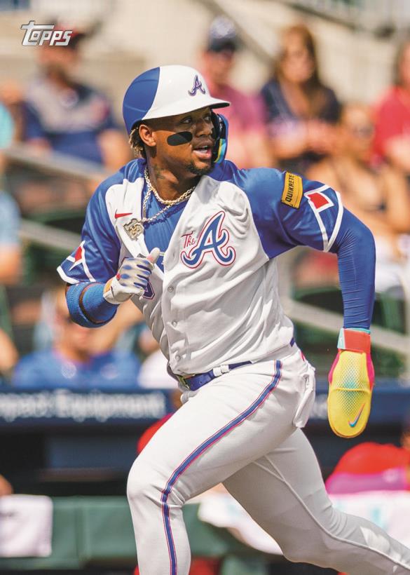
 www.sportscollectorsdaily.com
Checklist up too...

2024 Topps Series 1 Baseball Preview
Borderless case hits and Mirror Gold variations with different photos are part of 2024 Topps Series 1. Here's a preview and checklist.
- Thread starter
- #17
gt2590
Super Moderator
"Base Hobby" boxes are less cards, 4 less packs.
Ohtani autos included, Angels uni...
Ohtani autos included, Angels uni...
Therion
Well-known member
There are team color match variations.
Similar threads
- Replies
- 15
- Views
- 1K

