- Thread starter
- #361
banjar
Well-known member
Some 2010's Leaf Memories buybacks. Nothing fabulous, but kinda fun. I found the 1991 card the other day to complete this little run.


Disclaimer: Links on this page pointing to Amazon, eBay and other sites may include affiliate code. If you click them and make a purchase, we may earn a small commission.
Nice, I still like Padre Alomar stuff especially.
I have the Frank Thomas. If I recall, a lot of them I saw had some duzex issues (bubbling).And now for something completely different. I scanned the entire 1998 Pinnacle Uncut "card", which measures in at 13" x 19". My scanner could only do 1/4 of the card at a time, so it took a while to merge the images. But it turned out OK. The starburst background and dufex uniforms make such a nice design.
View attachment 344987
")
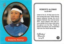
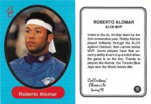
And now one of the most obscure variations from the junk wax era, the 1991 Topps "pink number" card. The first scan below is the normal card, second is the pink number. With the normal card, the card number and Topps logo on back are not colored, they are just the same cardboard color as most of the card back. On the second those areas are colored pink, just like the rest of the banner containing the player's name and personal bio info.
View attachment 345279
View attachment 345280
The 1992 Pinnacle Promo.
The base card is first, followed by the promo. The differences are minute. On the promo, the "SECOND BASE" text on the front is not aligned with the white box around the player, and the TM's by the Pinnacle logo and the team name are slightly smaller. I know the promo card is a promo because I bought a dealer promo set with 8 cards, and studied them versus the base cards. These little changes must have been made at the very end of the design process, before printing the packed out cards.
I wrote more info about this and other early 90's Score/Pinnacle promos on another thread here, but thought I'd post this one here to just for the hell of it.
View attachment 345291
View attachment 345292
Love stuff like this!I was driving down I-25 the other day, and for no good reason I was pondering the most obscure cards in my collection. The ones only found in the fringes of decent society, in the deepest recesses of the dark web. The ones that only goths and hipsters know about.
I've probably mentioned one or two of these before, but here they are anyway. Cards like these give me just as big a charge as landing most of those rare 90's inserts.
Today's post:
2018 Sobeys Promotional
Sobeys is a Canadian supermarket chain, and apparently they had some sort of promotional signing with Robbie Alomar in 2018. For which they printed some giveaway cards. And one of them popped up on ebay. I haven't seen another one for sale since, so they must have been pretty limited. Really glad to have a copy.
View attachment 345261
Did you scan the same card twice? I am not seeing a pink number/logo. Maybe my eyes are failing me?And now one of the most obscure variations from the junk wax era, the 1991 Topps "pink number" card. The first scan below is the normal card, second is the pink number. With the normal card, the card number and Topps logo on back are not colored, they are just the same cardboard color as most of the card back. On the second those areas are colored pink, just like the rest of the banner containing the player's name and personal bio info.
View attachment 345279
View attachment 345280
I love this one because of the subtle differences.
Love stuff like this!