- Thread starter
- #1
You are using an out of date browser. It may not display this or other websites correctly.
You should upgrade or use an alternative browser.
You should upgrade or use an alternative browser.
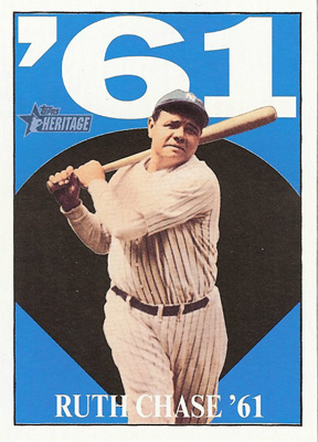
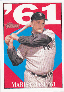
What an amazing triple cut auto!!!! :0
- Thread starter G $MONEY$
- Start date
Disclaimer: Links on this page pointing to Amazon, eBay and other sites may include affiliate code. If you click them and make a purchase, we may earn a small commission.
Erich
Active member
Whomever designed that card needs to fired.G $MONEY$ said:
- Thread starter
- #3
Erich said:Whomever designed that card needs to fired.G $MONEY$ said:
Yeah the card doesn't have the greatest design, but i can live with it as id just be staring at the cuts. Also impressed that they almost got all three cuts on the card without having to cut off half of a players name, haha. I would have choosen a different Maris cut though, one without the Cardinals logo!!
MaineMule
Active member
G $MONEY$ said:Yeah the card doesn't have the greatest design, but i can live with it as id just be staring at the cuts. Also impressed that they almost got all three cuts on the card without having to cut off half of a players name, haha. I would have choosen a different Maris cut though, one without the Cardinals logo!!
...that's the first thing I noticed. It's a great triple auto though. That starting price is a little crazy though.......
Erich said:Whomever designed that card needs to fired.G $MONEY$ said:
Kinda disagree. The colors of the set are loud (black, yellow, red, white) and therefore I don't mind how busy the signatures and their backgrounds are.
PujolsCollector
Active member
I love the cardinals logo on the Maris!!!
alabamalongsnake
New member
I think it's a great looking card especially for cuts.
Musial Collector
Active member
- Aug 7, 2008
- 5,671
- 2
jcmint said:I am guessing it is supposed to be a Yankees great card. The cards logo on the Maris had to be an oversight.
Even with the kindergarten design the overlook is worse. I would say waste of three cuts.
Actually, in the lower right it says "Chase '61", so yes they are Yankee greats, however this card is clearly for the '61 home run chase.
This card has come up for discussion a few times on FCB
Great concept, poor execution (too busy of backgrounds on each cut IMO)
Musial Collector said:jcmint said:I am guessing it is supposed to be a Yankees great card. The cards logo on the Maris had to be an oversight.
Even with the kindergarten design the overlook is worse. I would say waste of three cuts.
Actually, in the lower right it says "Chase '61", so yes they are Yankee greats, however this card is clearly for the '61 home run chase.
This card has come up for discussion a few times on FCB
Great concept, poor execution (too busy of backgrounds on each cut IMO)
Are there really baseball fans who don't know how Babe Ruth, Roger Maris, and Mickey Mantle are related besides being Yankee greats?
wolfmanalfredo
Active member
jbhofmann said:I guess it's a matter opinion but I think to get three cuts, three pics, and to stay with the Heritage theme makes it a great design and the designer should have gotten a promotion.
Agreed, 63 topps had some bright colors, and I think this card represents that well.
daveyou
New member
saw that card a few times and although the concept of putting those three in one card is just awesome, id have preferred if they put ruth cut on the front while both maris n mantle in the back
dave
dave
jubei777
New member
- Aug 7, 2008
- 640
- 0
i think for once topps did a pretty good job on that triple cut. usually there's bits and pieces here and there that are cut off. pretty crazy price though.
uniquebaseballcards
New member
- Nov 12, 2008
- 6,783
- 0
I think they did a decent design job there for a card. The issue some people have is that when they think of a Ruth (or Mantle, or Maris) auto, they don't think of an auto'd baseball card, they think of an auto'd baseball.
Similar threads
- Replies
- 3
- Views
- 718
- Replies
- 6
- Views
- 597
- Replies
- 8
- Views
- 918


