- Thread starter
- #1
Some of you may have taken Art Appreciation in college. The purpose of the class is to analyze and understand various paintings through the ages to find and understand the meaning or see the beauty inherent in the work of art. Well, here is a Card Apprecation thread...
Many times, we open the bubble mailer, briefly look at the card and then tuck it away in a box, binder or shoebox where it never sees the light of day. For me, lately it has been all about eye appeal. I've only bought four autographs over the past year, and traded for three more. I try only to pick up a few select cards which really call out to me, not because they are rare or are the product-hit, but because they are so perfect, that I must have them.
Let's see your masterpieces, any why you love them.
These two are my favorites:
1. 1996 Fleer - This base card is worth close to nothing, but I'll take it over the shiny refractors, superfractors and parallels. Such a simple design with a card stock which is ideal for autographs. It depicts a young Rivera at the start of his career in a gritty pose, with his signature delivery. The signature is a perfect and crisp example of his early auto, circa 1996. He signed it in the lighter portion of the card, over the infield dirt, to allow the signature to stand out. Yet it is signed in the perfect spot on the bottom right above his printed name embossed in gold, as if he was signing a letter.

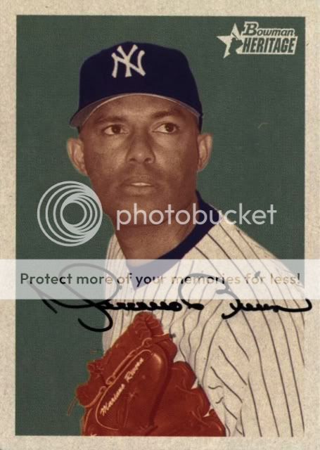
2. 2006 Bowman Heritage - This one could be in a museum next to Warhol's Mariyln or Che. An iconic pose of Rivera, which is enhanced visually with the three-tone spot color. Has a crisp signature from later in his career. Just like Rivera's pitch location, his signature placement is impeccable. Starting below his collar and just above his glove, right on the white portion of the card. Anywhere else, and the colors would have clashed. This is a perfect example of his signature from later in his career, far different that the one above, much sleeker and toned down, but not sloppy or rushed from all the years of signing.
Many times, we open the bubble mailer, briefly look at the card and then tuck it away in a box, binder or shoebox where it never sees the light of day. For me, lately it has been all about eye appeal. I've only bought four autographs over the past year, and traded for three more. I try only to pick up a few select cards which really call out to me, not because they are rare or are the product-hit, but because they are so perfect, that I must have them.
Let's see your masterpieces, any why you love them.
These two are my favorites:
1. 1996 Fleer - This base card is worth close to nothing, but I'll take it over the shiny refractors, superfractors and parallels. Such a simple design with a card stock which is ideal for autographs. It depicts a young Rivera at the start of his career in a gritty pose, with his signature delivery. The signature is a perfect and crisp example of his early auto, circa 1996. He signed it in the lighter portion of the card, over the infield dirt, to allow the signature to stand out. Yet it is signed in the perfect spot on the bottom right above his printed name embossed in gold, as if he was signing a letter.
2. 2006 Bowman Heritage - This one could be in a museum next to Warhol's Mariyln or Che. An iconic pose of Rivera, which is enhanced visually with the three-tone spot color. Has a crisp signature from later in his career. Just like Rivera's pitch location, his signature placement is impeccable. Starting below his collar and just above his glove, right on the white portion of the card. Anywhere else, and the colors would have clashed. This is a perfect example of his signature from later in his career, far different that the one above, much sleeker and toned down, but not sloppy or rushed from all the years of signing.
Last edited: