
- Thread starter
- #1
MatthewN
Active member
1996 Topps Profiles. Not the most exciting insert set out there. And what I’ve learned about them recently does not exactly result in a very exciting set of ground breaking variations that somehow escaped our attention for 20 years. These are not epic variations. But, it seems there are some very consistent inconsistencies/variations in Topps’ printing of these cards.
As a Puckett collector, I’ve had a set of the 20 American League cards for basically 20 years. I’m sure I’ve given them as much thought as Kirby put into the profiles which reside on the back of these cards (let’s assume “his people” did the writing, or Topps, am I right?).
I’d really never paid much attention to the set until January when @nosterbor posted this:
http://www.freedomcardboard.com/for...-s-Inserts-3?p=2338208&viewfull=1#post2338208
So I pulled out my binder, took a closer look, and discovered that I actually did have two that didn’t match the other 18. This of course led me to scour COMC for similar variations. And that of course led me to rolling the dice on a bunch of sight unseen 18 cent cards on Sportlots.
The result of all of this is that I believe there are four consistent variations of 1996 Topps Profiles. My best guess is that these variations resulted from different printing presses, and not from a conscious decision by Topps to change the way the foil was applied, but I have no real basis for that. It’s a guess.
Also please note, I believe that all of this information also pertains to the National League cards, though I don’t actually own any of them. I have looked at all that COMC has to offer, and it appears the trends are the same for the NL as the AL set.
All images of cards you see below were the result of placing the variation cards next to each other on the scanner in hopes of accurately showing those variations with the same scan.
I describe the four as: (1)Shine, (2)Glaze, (3)Glaze with Bold Back, and (4)Heavy Foil.
Shine – This is the Series 1 (Cards 1-10/White border) base card. This is also a seemingly rare Series 2 variation. In the Randy Johnson image, the shine card is the one on the left. It’s smooth with no foil texture and generally the subject “pops” out from the background which generally scans darker. Also, the “O” in “Profiles” often appears out of focus while the rest of the card is sharp in scans, based on my experience. (The Randy Johnson on the right is a Glaze, it might look like a Heavy Foil, but it is not, there is a Glaze over the subject and the entire card)
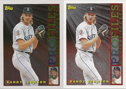
(Randy Johnson Shine/Glaze)
Glaze – This is the Series 2 (Cards 11-20/Silver border) base. @nosterbor referred to this as the “normal” version with his Juan Gonzalez, which it is for Series 2. In this case of Don Mattingly below we are talking about the card on the left. These cards have a consistent thin foil glaze over the entire card (and that’s very important to all of this), including the subject. This glaze generally does not show up in scans. When the card is tilted under light, it should be apparent that the glaze is included on the player. Glaze is also a periodic, but not regular, occurrence in Series 1, as evidenced by Randy Johnson on the right up above. (The Mattingly on the right is a Heavy Foil)

(Don Mattingly Glaze/Heavy Foil)
Glaze/Bold Back – This is a consistent Series 2 variation. Anything that includes black on the back of the card is significantly darker. The easiest place to located this variation is in the copyright text. I have not found this on any Heavy Foil cards, nor any Series 1 cards, and I believe it to be specific to Glaze Series 2 cards. On COMC these cards really pop out. You may notice some cards that look slightly darker on the back. Those are inconsistent scans based on my experiences (and errant purchases). The bold back is noticeably darker. There shouldn’t be any question in your mind as is clear with Jim Edmonds.
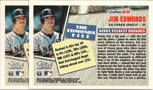
(Jim Edmonds Glaze with Normal Back/Glaze with Bold Black Back)
Heavy Foil - This is a consistent Series 2 variation. (@nosterbor referred to this as “Very Heavy Mat Finish”) It is what the name says it is, it has a heavy textured foil on the entire front of the card EXCEPT on the subject. The player will not have any glaze or foil. In the Kenny Lofton example below the card on the left is a Glaze, and the card on the right is a Heavy Foil. These cards usually produce a nice bright popping color throughout the front of the card. In his post @nosterbor indicated he had 2/100 of his Juan Gonzalez that would be classified as Heavy Foil. These are rarer than the base Glaze for Series 2, but I don’t think they are 2/100-rare.
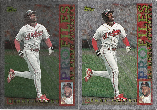
(Kenny Lofton Glaze/Heavy Foil)
Outliers
The last example @nosterbor presented is a significant print defect that I have not seen elsewhere. Though I have found other minor print defects or variations that don’t seem to show up with regularity.
The McGwire on the far right is actually best classified as a “Shine” variation, but this is rare because it’s Series 2. I’ve only found 2 examples of this.
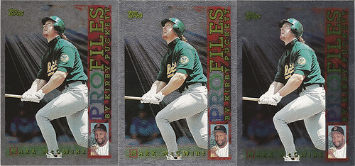
(Mark McGwire Glaze/Heavy Foil/Shine)
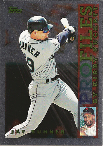
A random print circle on Jay Buhner’s shoulder:
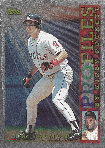
And this is a Tim Salmon with all kinds of funky glaze on it. This card actually looks worse in the scan than it does in person:
Identifying these online from eBay/COMC and pricing.
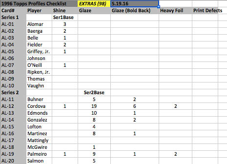
As you’ll see in my spreadsheets below, this is a crapshoot. It’s a crapshoot online, and at times, it’s a little tough to tell even when you’re holding the card.
I bought up a bunch thinking that I knew exactly what I was getting based on the scan/photo, only to find that it wasn’t the case. Obviously COMC is the best, eBay is generally terrible due to scan/photo inconsistencies, and Sportlots while sight unseen, is at least cheap.
I was amazed over the last few months how many of these showed up on eBay with listings of $2-3 + S/H, or even on COMC/Sportlots how overpriced some were. For the most part, you should never pay more than $1.25 for one of these, and often, you can even find Griffey in the 75 cent range. Marty Cordova resulted in a lot of 18 cent pickups as I tried to find his Glaze/Bold Back card to finish Series 2 for that column.
Ranking the Rarity
From easiest to hardest to find:
- Series 1 Shine and Series 2 Glaze are equally easy to find
- Series 2 Heavy Foil
- Series 2 Glaze/Bold Back
- Series 1 Glaze
- Series 2 Shine
- Other Print Defects
Unique Cards I Have Acquired in the Course of this Insanity
If you can help me fill in any gaps, please send me a PM.

Extras I’ve Acquired in the Course of this Insanity
If you need one of these, please send me a PM.
1996 Topps Profiles. Not the most exciting insert set out there. And while these are not epic variations, in my mind it’s clear that there are some very consistent inconsistencies/variations in Topps’ printing of these cards.
(Thanks for reading this nonsense, and this is your cue to dig out your 1996 Topps Profiles to see if you’ve got anything weird)
As a Puckett collector, I’ve had a set of the 20 American League cards for basically 20 years. I’m sure I’ve given them as much thought as Kirby put into the profiles which reside on the back of these cards (let’s assume “his people” did the writing, or Topps, am I right?).
I’d really never paid much attention to the set until January when @nosterbor posted this:
http://www.freedomcardboard.com/for...-s-Inserts-3?p=2338208&viewfull=1#post2338208
So I pulled out my binder, took a closer look, and discovered that I actually did have two that didn’t match the other 18. This of course led me to scour COMC for similar variations. And that of course led me to rolling the dice on a bunch of sight unseen 18 cent cards on Sportlots.
The result of all of this is that I believe there are four consistent variations of 1996 Topps Profiles. My best guess is that these variations resulted from different printing presses, and not from a conscious decision by Topps to change the way the foil was applied, but I have no real basis for that. It’s a guess.
Also please note, I believe that all of this information also pertains to the National League cards, though I don’t actually own any of them. I have looked at all that COMC has to offer, and it appears the trends are the same for the NL as the AL set.
All images of cards you see below were the result of placing the variation cards next to each other on the scanner in hopes of accurately showing those variations with the same scan.
I describe the four as: (1)Shine, (2)Glaze, (3)Glaze with Bold Back, and (4)Heavy Foil.
Shine – This is the Series 1 (Cards 1-10/White border) base card. This is also a seemingly rare Series 2 variation. In the Randy Johnson image, the shine card is the one on the left. It’s smooth with no foil texture and generally the subject “pops” out from the background which generally scans darker. Also, the “O” in “Profiles” often appears out of focus while the rest of the card is sharp in scans, based on my experience. (The Randy Johnson on the right is a Glaze, it might look like a Heavy Foil, but it is not, there is a Glaze over the subject and the entire card)
(Randy Johnson Shine/Glaze)
Glaze – This is the Series 2 (Cards 11-20/Silver border) base. @nosterbor referred to this as the “normal” version with his Juan Gonzalez, which it is for Series 2. In this case of Don Mattingly below we are talking about the card on the left. These cards have a consistent thin foil glaze over the entire card (and that’s very important to all of this), including the subject. This glaze generally does not show up in scans. When the card is tilted under light, it should be apparent that the glaze is included on the player. Glaze is also a periodic, but not regular, occurrence in Series 1, as evidenced by Randy Johnson on the right up above. (The Mattingly on the right is a Heavy Foil)
(Don Mattingly Glaze/Heavy Foil)
Glaze/Bold Back – This is a consistent Series 2 variation. Anything that includes black on the back of the card is significantly darker. The easiest place to located this variation is in the copyright text. I have not found this on any Heavy Foil cards, nor any Series 1 cards, and I believe it to be specific to Glaze Series 2 cards. On COMC these cards really pop out. You may notice some cards that look slightly darker on the back. Those are inconsistent scans based on my experiences (and errant purchases). The bold back is noticeably darker. There shouldn’t be any question in your mind as is clear with Jim Edmonds.
(Jim Edmonds Glaze with Normal Back/Glaze with Bold Black Back)
Heavy Foil - This is a consistent Series 2 variation. (@nosterbor referred to this as “Very Heavy Mat Finish”) It is what the name says it is, it has a heavy textured foil on the entire front of the card EXCEPT on the subject. The player will not have any glaze or foil. In the Kenny Lofton example below the card on the left is a Glaze, and the card on the right is a Heavy Foil. These cards usually produce a nice bright popping color throughout the front of the card. In his post @nosterbor indicated he had 2/100 of his Juan Gonzalez that would be classified as Heavy Foil. These are rarer than the base Glaze for Series 2, but I don’t think they are 2/100-rare.
(Kenny Lofton Glaze/Heavy Foil)
Outliers
The last example @nosterbor presented is a significant print defect that I have not seen elsewhere. Though I have found other minor print defects or variations that don’t seem to show up with regularity.
The McGwire on the far right is actually best classified as a “Shine” variation, but this is rare because it’s Series 2. I’ve only found 2 examples of this.
(Mark McGwire Glaze/Heavy Foil/Shine)
A random print circle on Jay Buhner’s shoulder:
And this is a Tim Salmon with all kinds of funky glaze on it. This card actually looks worse in the scan than it does in person:
Identifying these online from eBay/COMC and pricing.
As you’ll see in my spreadsheets below, this is a crapshoot. It’s a crapshoot online, and at times, it’s a little tough to tell even when you’re holding the card.
I bought up a bunch thinking that I knew exactly what I was getting based on the scan/photo, only to find that it wasn’t the case. Obviously COMC is the best, eBay is generally terrible due to scan/photo inconsistencies, and Sportlots while sight unseen, is at least cheap.
I was amazed over the last few months how many of these showed up on eBay with listings of $2-3 + S/H, or even on COMC/Sportlots how overpriced some were. For the most part, you should never pay more than $1.25 for one of these, and often, you can even find Griffey in the 75 cent range. Marty Cordova resulted in a lot of 18 cent pickups as I tried to find his Glaze/Bold Back card to finish Series 2 for that column.
Ranking the Rarity
From easiest to hardest to find:
- Series 1 Shine and Series 2 Glaze are equally easy to find
- Series 2 Heavy Foil
- Series 2 Glaze/Bold Back
- Series 1 Glaze
- Series 2 Shine
- Other Print Defects
Unique Cards I Have Acquired in the Course of this Insanity
If you can help me fill in any gaps, please send me a PM.
Extras I’ve Acquired in the Course of this Insanity
If you need one of these, please send me a PM.
1996 Topps Profiles. Not the most exciting insert set out there. And while these are not epic variations, in my mind it’s clear that there are some very consistent inconsistencies/variations in Topps’ printing of these cards.
(Thanks for reading this nonsense, and this is your cue to dig out your 1996 Topps Profiles to see if you’ve got anything weird)
")
![20160919_212535[1].jpg](/forum/data/attachments/45/45031-f93543fc05749e5046028e6901d57eef.jpg)